2025
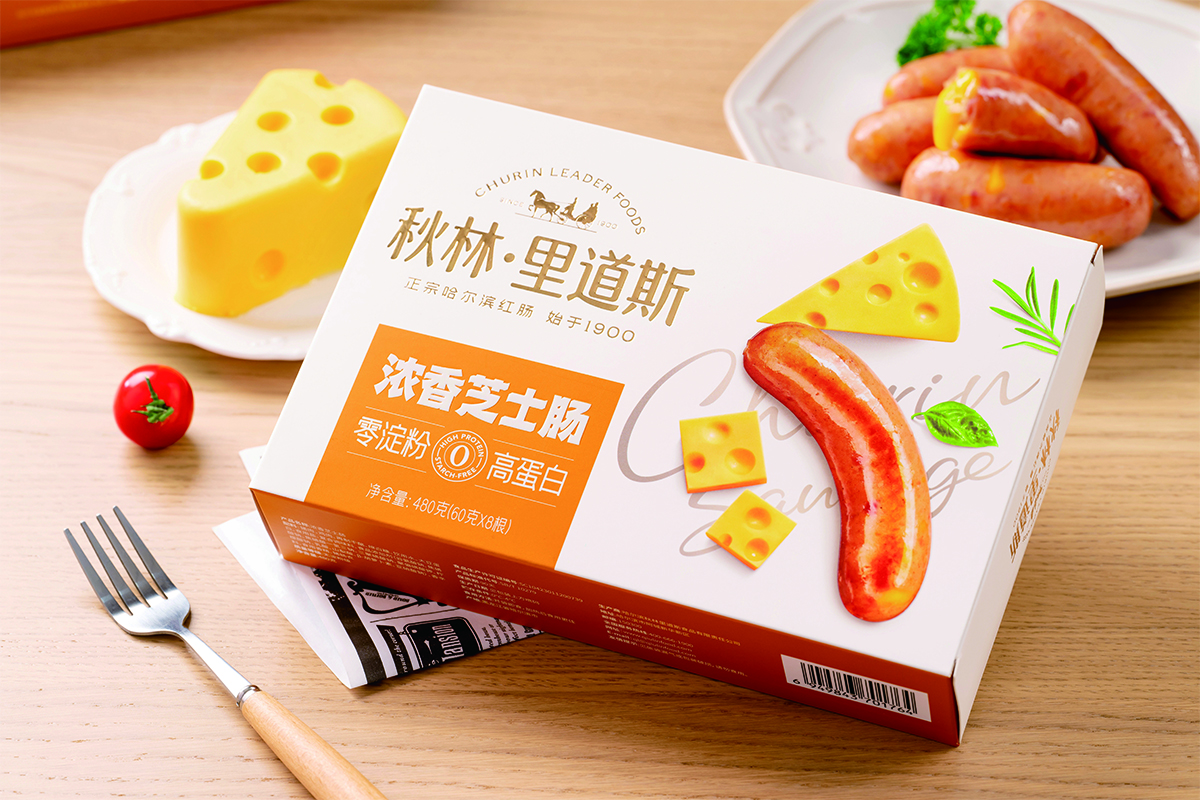
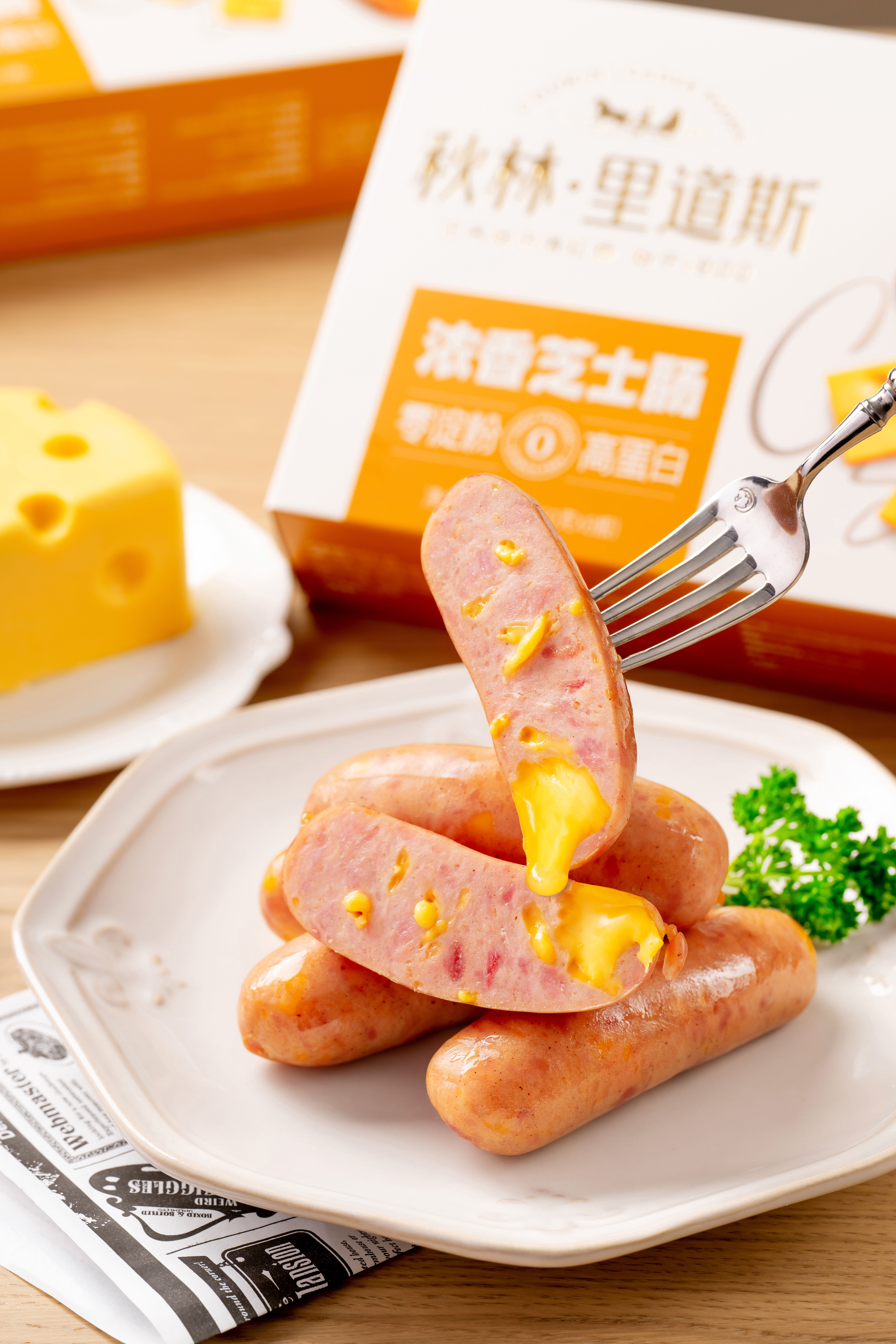
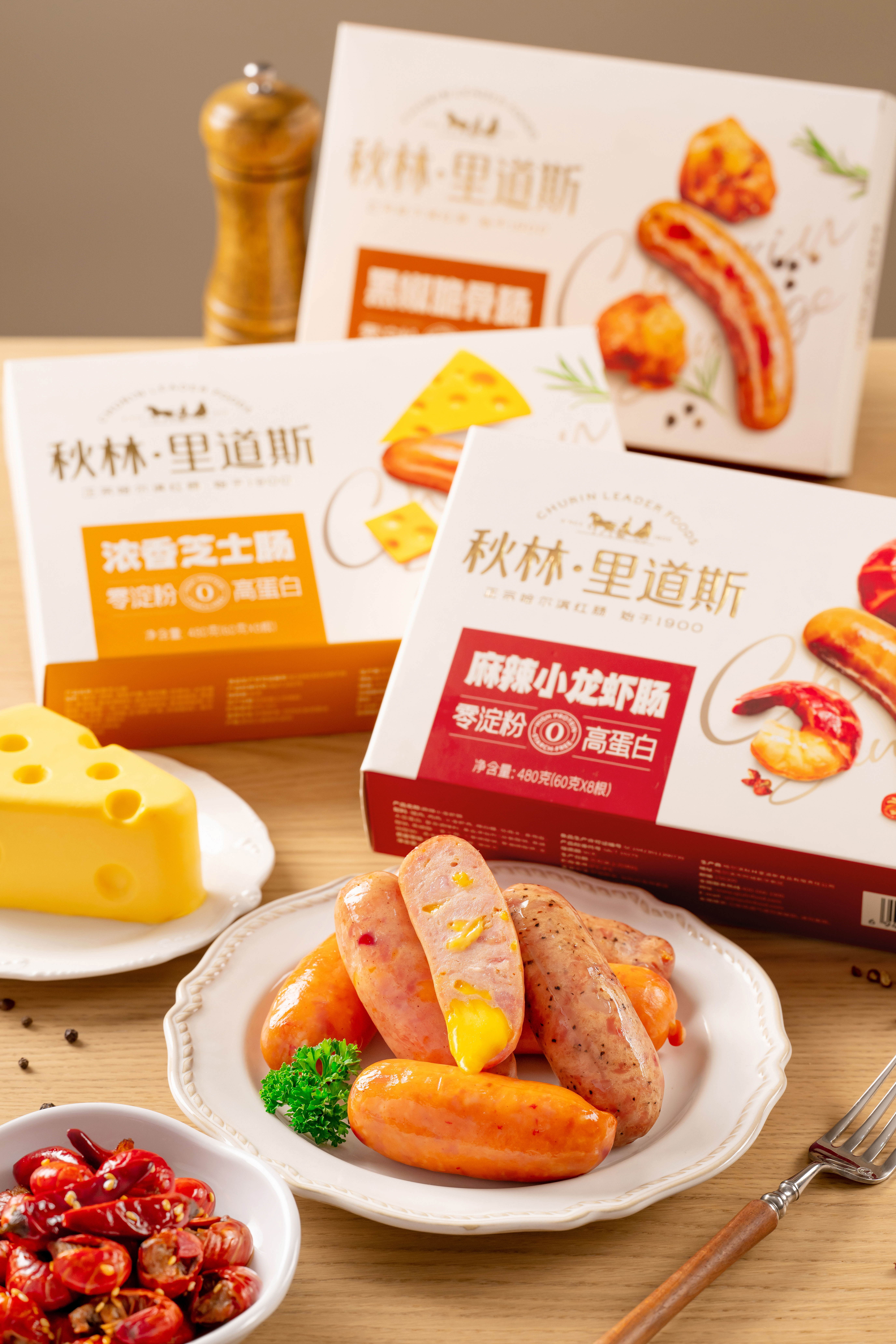
Churin Leaderfoods Rich Creamy Cheese Sausage
Entrant
Harbin Churin Leaderfoods Co., Ltd.
Category
Food - Ready-to-Eat, Fast Food, Meal Kits
Client's Name
Country / Region:
China
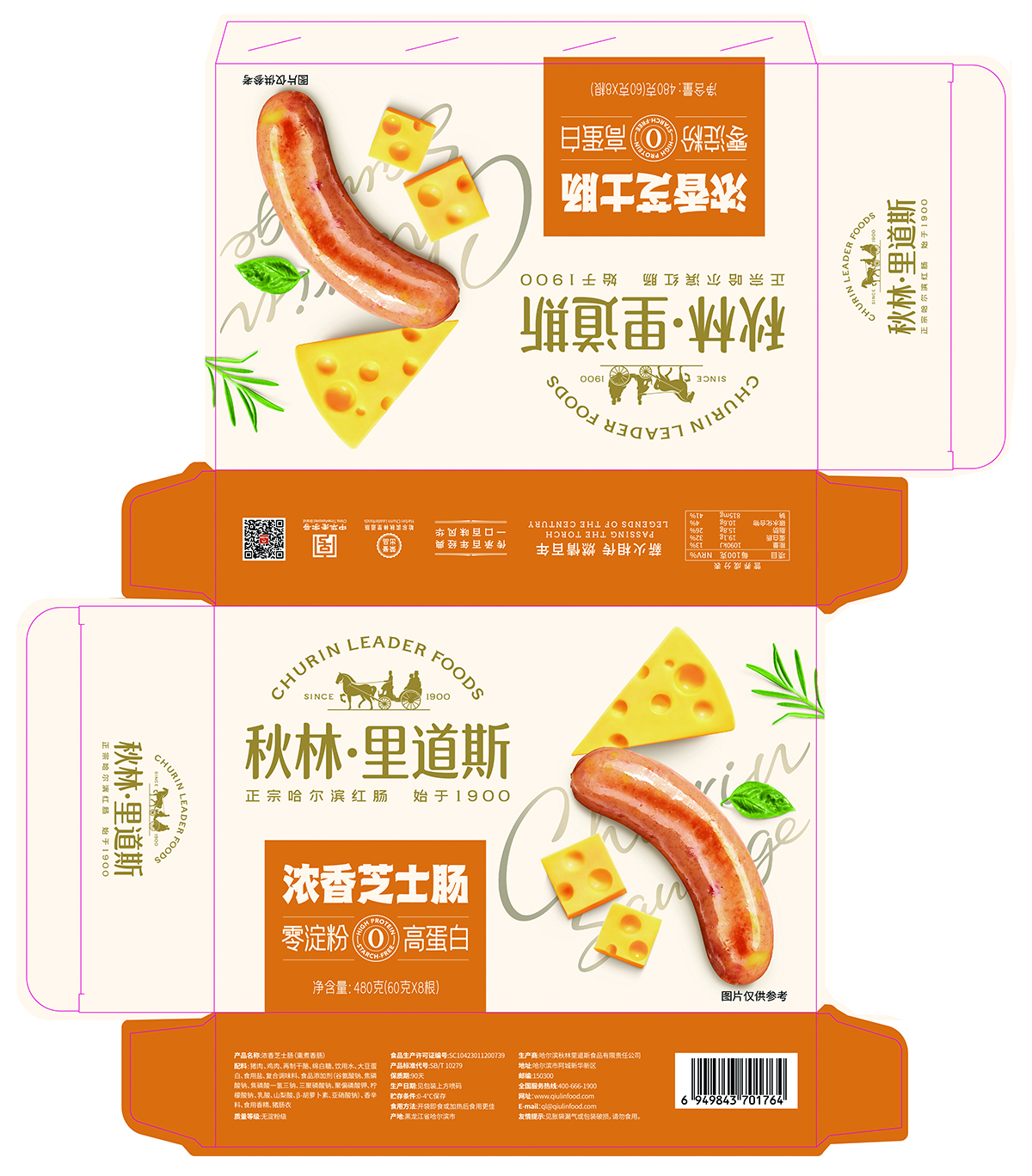
This packaging design builds upon the century-old heritage of Churin Leaderfoods red sausage, reimagining the visual identity for its new product, “Rich Creamy Cheese Sausage.” Departing from the heavy, traditional aesthetics typical of meat products, the concept establishes a fresh visual system that balances appetite appeal with a light, modern sensibility—directly addressing younger consumers’ desire for food that is delicious, healthy, and meaningful. The central visual features hand-drawn illustrations that meticulously capture the smoked texture of the sausage, the stretchy richness of cheese chunks, and the natural form of fresh herbs. Rendered with delicate strokes, the artwork emphasizes ingredient authenticity, reinforcing the perception of quality and craftsmanship while adding a human, artisanal warmth to the packaging. Color plays a transformative role: a warm, vibrant orange is used as the primary tone, breaking category conventions to evoke flavor excitement and signal innovative taste, while a clean white background enhances purity and contemporary clarity—creating strong shelf impact. The brand’s iconic “Since 1900” mark is subtly integrated through foil stamping in a corner of the layout, preserving the minimalist aesthetic while quietly anchoring the product in its historical legacy and building consumer trust. Information is structured according to visual hierarchy and reading flow. The product name and key selling points—“Rich & Cheesy Sausage,” “No Starch,” “High Protein”—are presented in a custom typeface that balances legibility with brand character, while nutritional and ingredient details are arranged in clear, modular blocks to ensure transparency and ease of comprehension. Visually, the design achieves a harmonious balance between tradition and modernity: the hand-crafted illustration echoes the brand’s century-old craftsmanship, while the minimalist composition and fresh color palette align with today’s lifestyle aesthetics. Through this cohesive visual language, the packaging transcends its functional role to become a communication medium—connecting brand and consumer by resonating with their desire for flavorful, wholesome, and authentic food. It transforms the package into a core vehicle for brand storytelling and emotional engagement.
Entrant
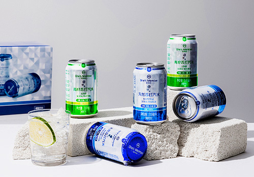
Shanghai Zhiao No.1 Store Information Technology Co., Ltd.
Category
Beverage - Beers, Ciders, Hard Seltzer & Malt
Country / Region
China

Entrant
ZHUHAI WEIHUA FIRE PROTECTION ENGNIEERING CO.,LTD
Category
Industrial Equipment, Machinery & Automation - Fire Protection System
Country / Region
China
Entrant
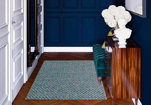
Zhejiang Junxiao Home Furnishings Co., Ltd.
Category
Decorative Items - Carpets
Country / Region
China
Entrant
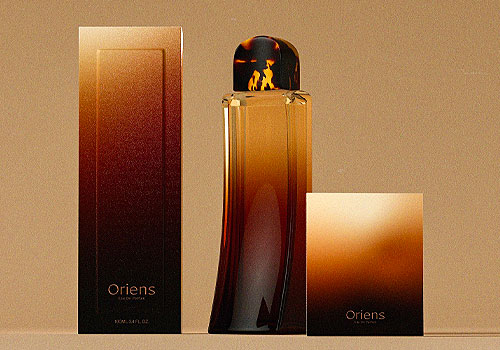
Shuairen Wang
Category
Body, Health & Beauty - Perfumes & Fragrances
Country / Region
United States