2026
CHIOSTRO DI SARONNO SPECIALITÀ
Entrant
TooBlu (Blureflex Group)
Category
Food - Desserts & Sweets
Client's Name
Paolo Lazzaroni & Figli
Country / Region:
Italy
Paolo Lazzaroni & Figli, based in Saronno, Italy, is an eight-generation family company that has built an international reputation for excellence in fine Italian food and liqueurs. With brands such as Lazzaroni and Chiostro di Saronno, the company preserves and evolves authentic recipes passed down through centuries.
Following the sale of its biscuit division in 1984, Paolo Lazzaroni refocused the company on liqueurs and premium confectionery, revitalizing the historic Chiostro di Saronno brand. Today, the seventh and eighth generations continue to guide the company with a philosophy rooted in passion, continuity, and innovation within tradition.
The brief called for the creation of new luxury packaging for the Chiostro di Saronno biscuit and amaretti lines dedicated to special channels — primarily travel retail, duty free, and premium highway food services.
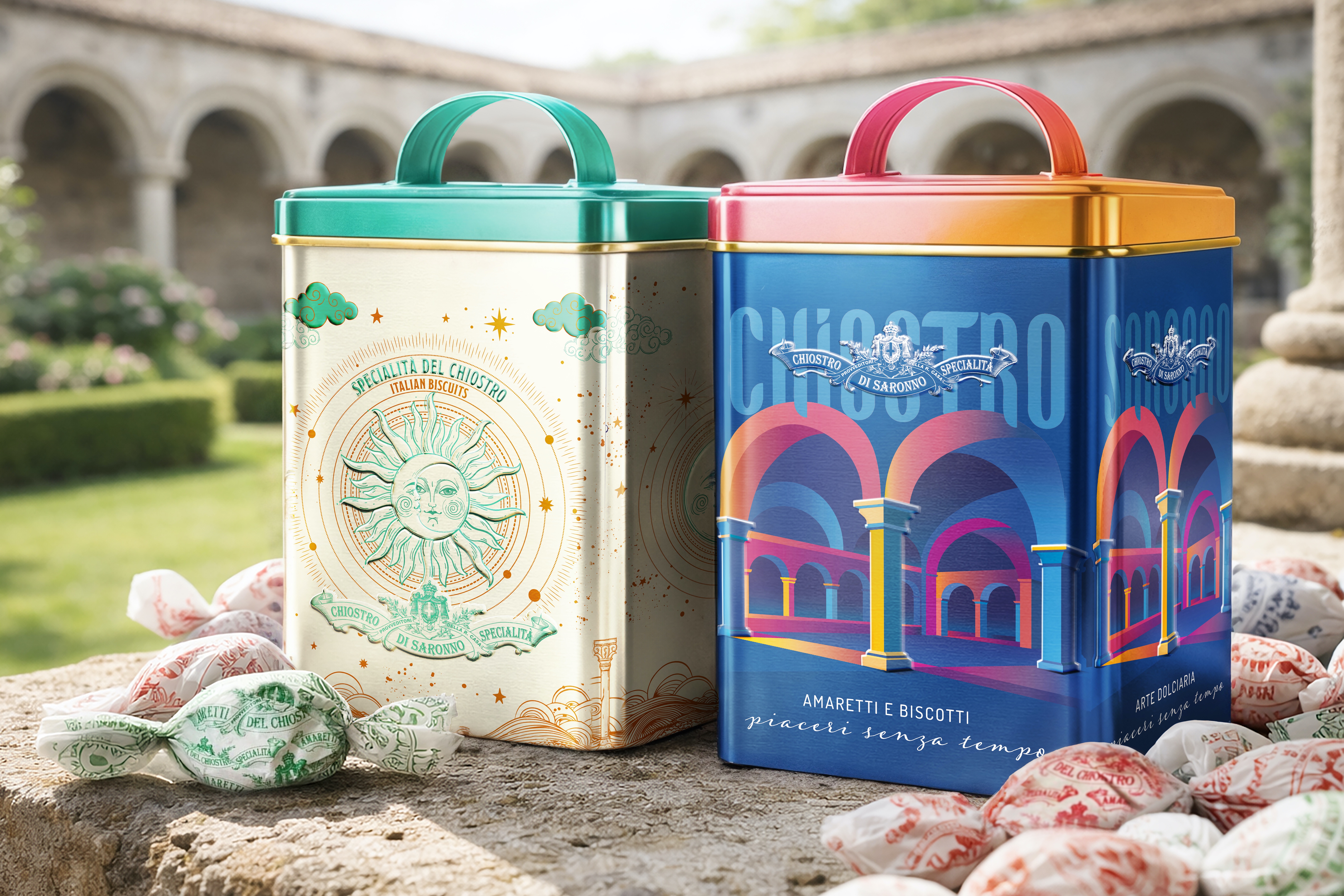
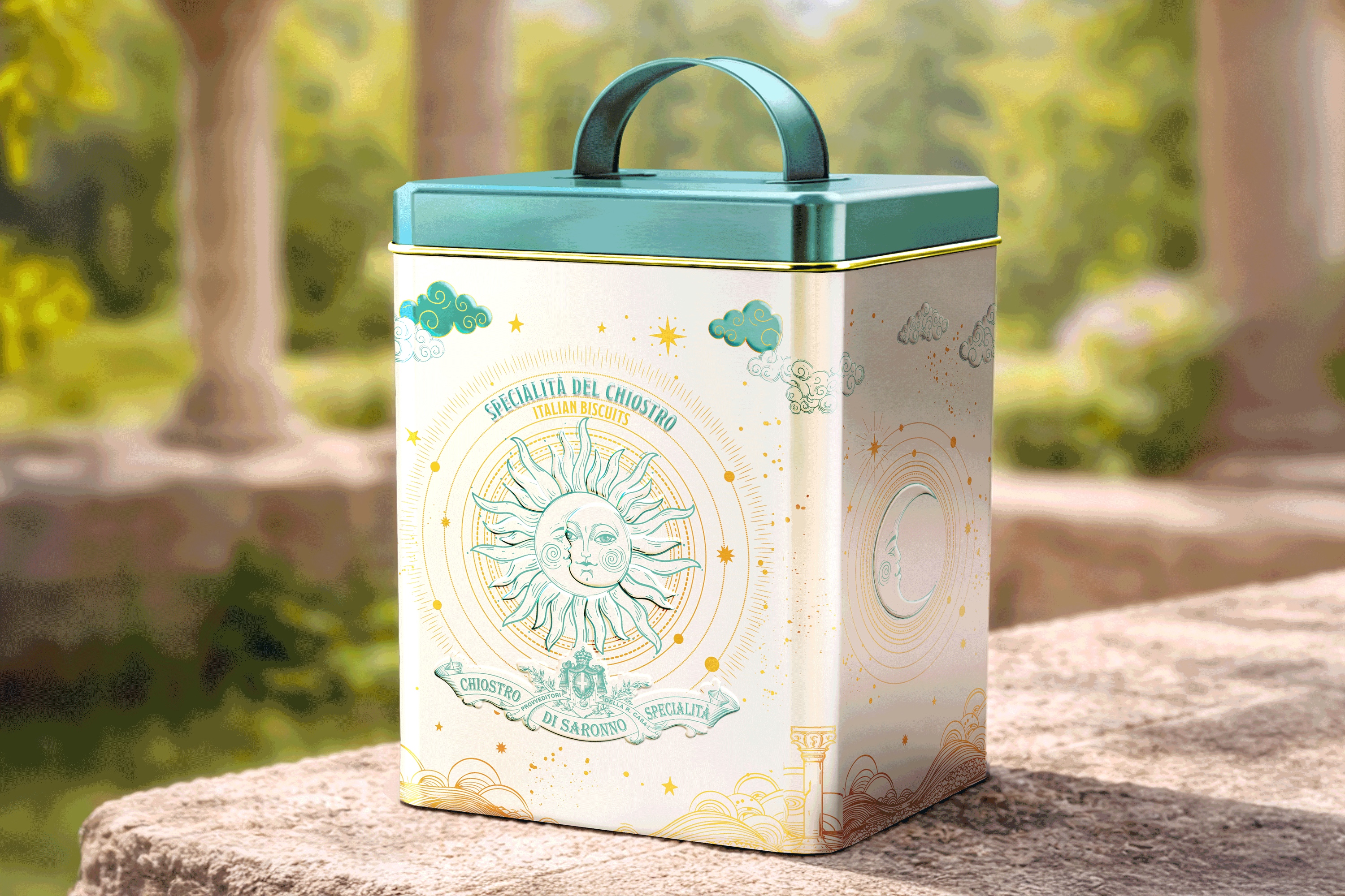
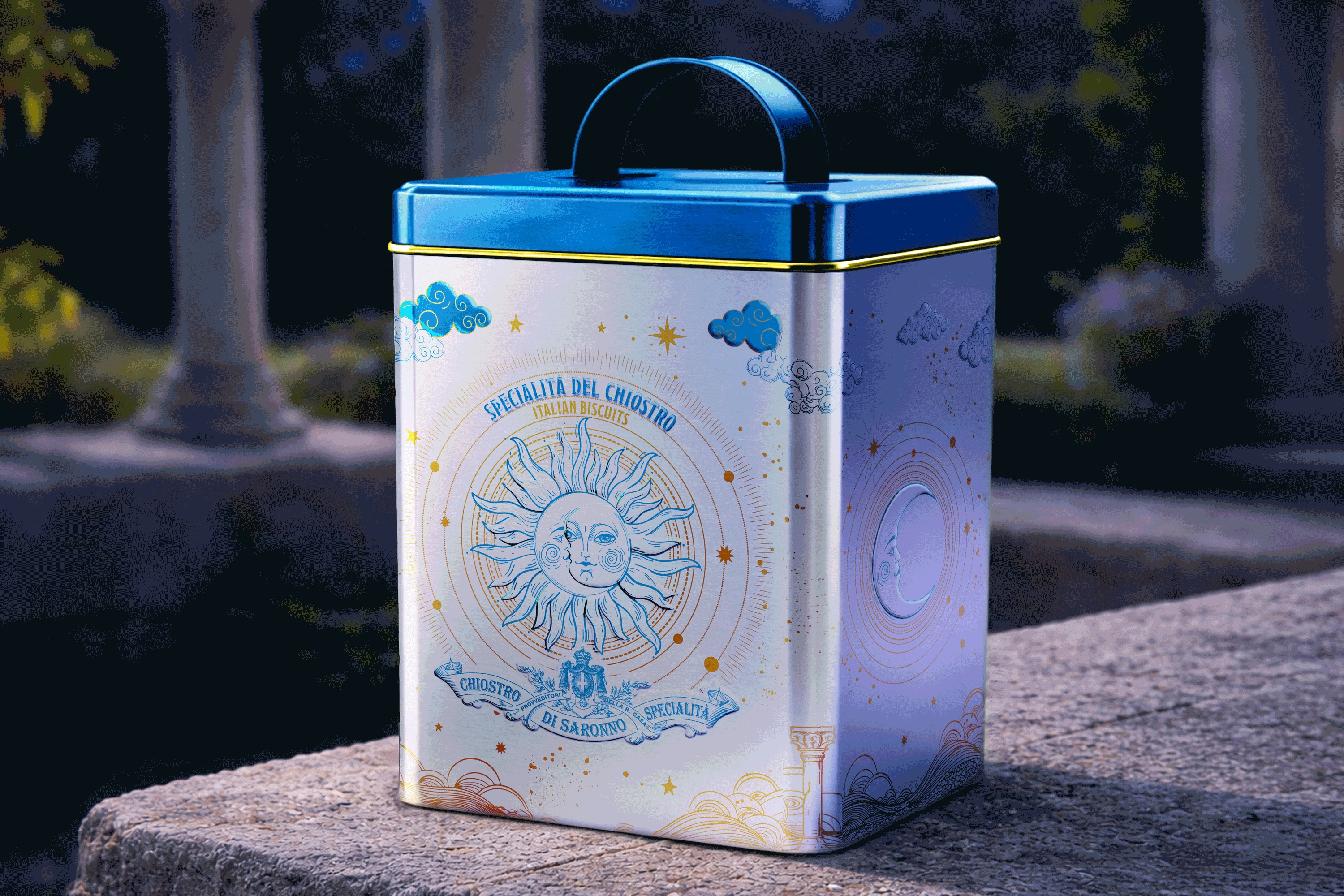
The creative strategy draws inspiration from the iconic Franciscan cloister in Saronno, a powerful architectural and symbolic element deeply connected to the brand’s identity. Two distinct creative routes were developed to balance tradition and modernity, the tangible and the dreamlike.
The first interprets the cloister as a metaphysical space suspended between earth and sky, between chronological time and eternity. The packaging evokes a celestial dimension, where arches open toward stars and planets, creating an ethereal, almost visionary atmosphere.
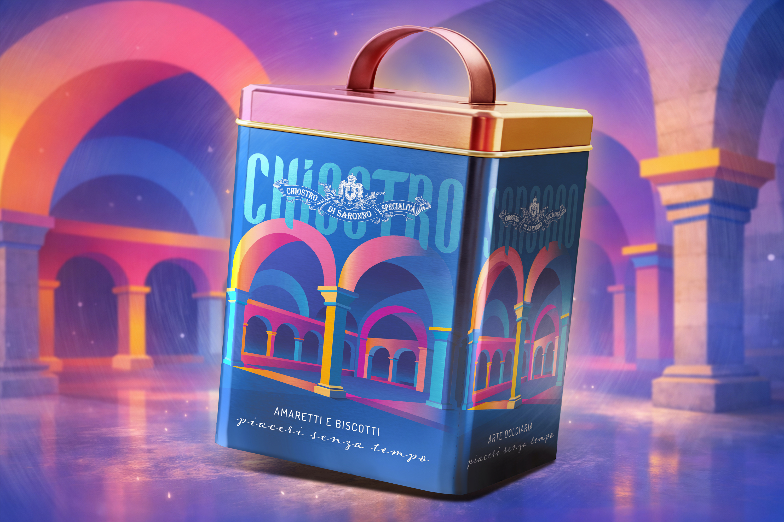
The second concept highlights the cloister’s architectural perspective. Bright, contemporary color palettes and dynamic angles enhance depth and volume, while rounded typography echoes the classical arches, translating historical architecture into a modern visual language.
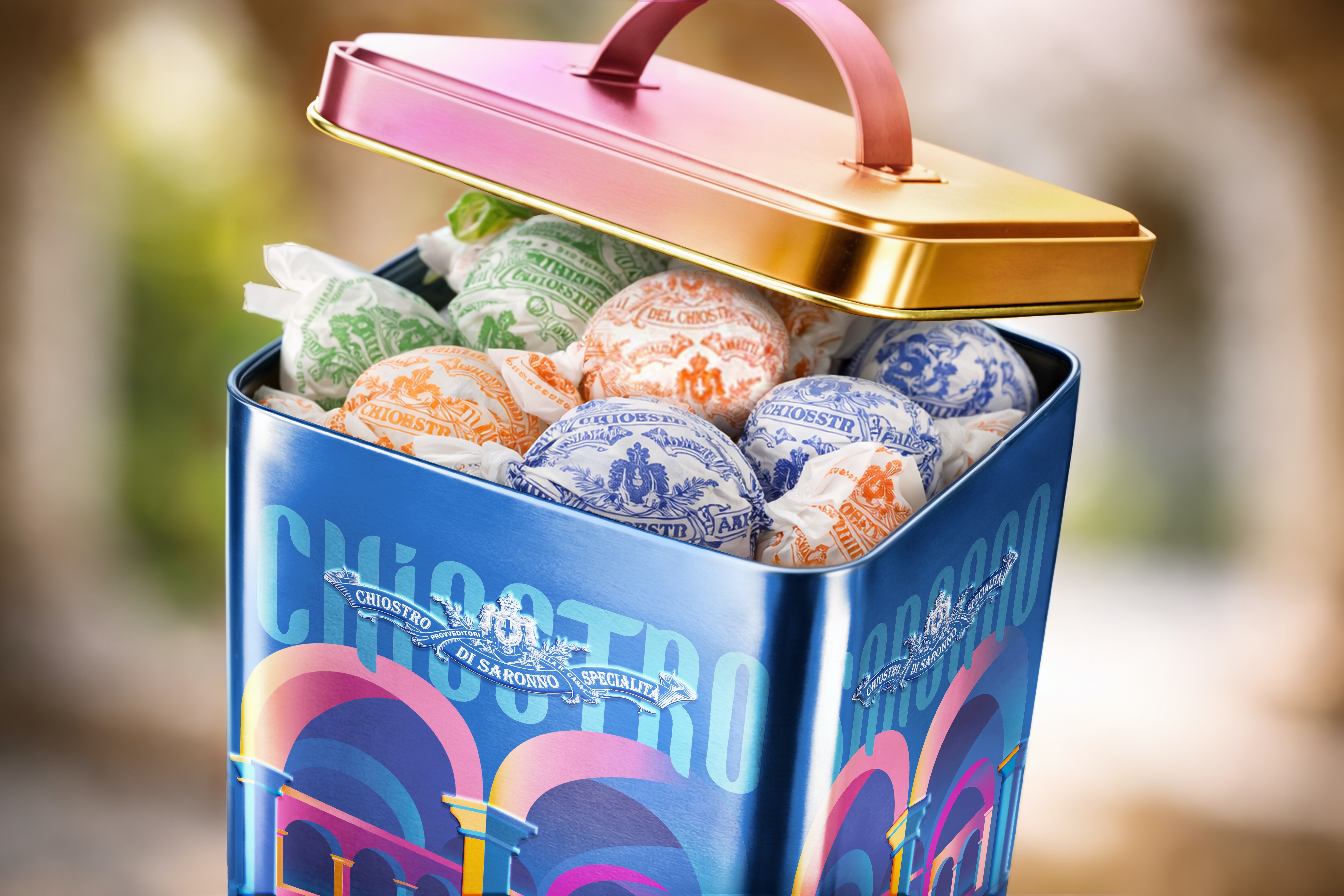
Payoffs such as “Specialità del Chiostro” and “Timeless Pleasures” reinforce product quality and heritage. The vertical, structured boxes — complete with handles and refined finishing details — are designed to be displayed, reused, and treasured beyond their edible contents.
Through lithography, embossing, spot matte varnish, and selective metallic finishes, the packaging elevates tactile and visual perception.
By innovating the brand’s traditionally classical language without compromising its identity, this project demonstrates how heritage can evolve — and how design can transform legacy into contemporary desirability.
Credits
Entrant
KISSKY (HK) LIMITED
Category
Recreational Technology - Sex & Hygiene
Country / Region
Hong Kong SAR
Entrant
Furever.AI
Category
User Experience (UX) - Product UX
Country / Region
United States
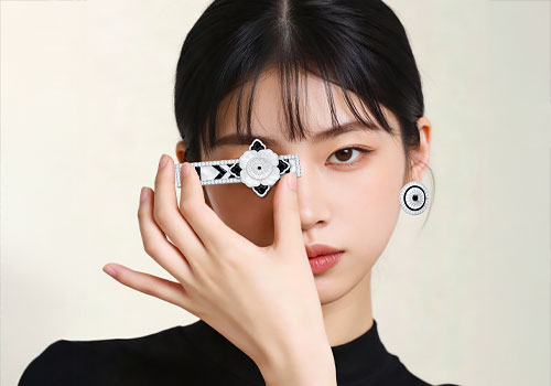
Entrant
Huang Xiaomin
Category
Jewelry - Jewelry Collections
Country / Region
China
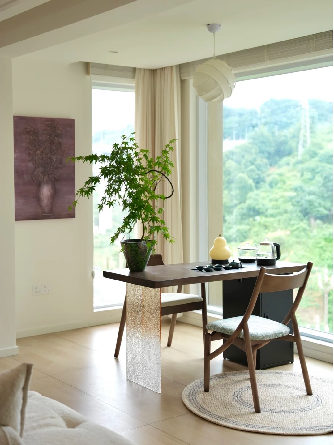
Entrant
Sichuan Yunteeng Furniture Co., Ltd.
Category
Table & Desks Furniture - Tea Table
Country / Region
China