2026 Silver Winner
Packaging
Hi!papa All-School-Age Stage Skincare Series
Entrant: Guangzhouhaigui Papa Biotechnology Co.,Ltd.
2026
Silver
A closer look
Project gallery.
Select a thumbnail to browse. Click the main image to enlarge.
CategoryPackaging
Class / SubcategoryBody, Health & Beauty
Childcare
Childcare
Country / Region China
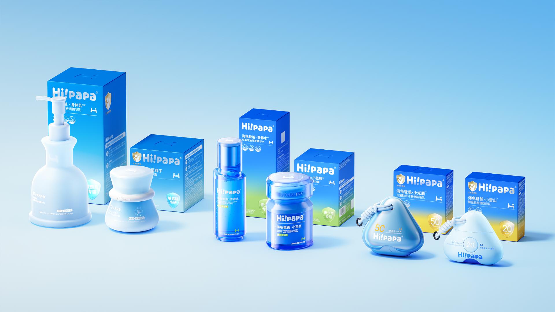
ChinaInspired by “The Beauty of Protective Companionship Through Growth,” the Hi!papa All-School-Age Stage Skincare Series offers a differentiated packaging system for each stage of childhood. Tailored to the distinct care needs and daily routines of infants aged 0 to 3, children 6 to 12, and teens 14 and up, the design weaves an age-specific skincare philosophy into its visual identity, product form, and user experience.
Anchored by the signature Hi!papa Blue, the color system assigns Baby Blue to gentle infant care, Sunlight Yellow to children’s outdoor sun care, and Natural Green to teen oil-control and anti-acne series. Together, these hues establish a unified and clear age-specific identification. Clean geometric forms meet smooth, flowing curves across the series. The infant series conveys warmth and approachability through softly rounded bottles. The children’s sun care series features a shield-shaped silhouette that reinforces a sense of protection. Paired with a braided lanyard and clip, the bottle doubles as a wearable accessory that hooks onto backpacks and other gear for outdoor portability. For the teen series, refined bottle proportions and grip zones better suit more mature usage habits.
To express the brand identity, the design distills the “Hi” element from “Hi!papa” into an approachable visual symbol, evoking a warm sense of friendliness and companionship. A clear layout hierarchy and unified typographic rules highlight the brand logo, product name, and core information. This structure balances readability with a cohesive shelf presence across the line.
By harmonizing color, form, and brand symbols, the series maintains brand consistency while establishing a distinct product identity for each growth stage. It blends scientific age-specific skincare with a youthful, approachable brand experience.
Anchored by the signature Hi!papa Blue, the color system assigns Baby Blue to gentle infant care, Sunlight Yellow to children’s outdoor sun care, and Natural Green to teen oil-control and anti-acne series. Together, these hues establish a unified and clear age-specific identification. Clean geometric forms meet smooth, flowing curves across the series. The infant series conveys warmth and approachability through softly rounded bottles. The children’s sun care series features a shield-shaped silhouette that reinforces a sense of protection. Paired with a braided lanyard and clip, the bottle doubles as a wearable accessory that hooks onto backpacks and other gear for outdoor portability. For the teen series, refined bottle proportions and grip zones better suit more mature usage habits.
To express the brand identity, the design distills the “Hi” element from “Hi!papa” into an approachable visual symbol, evoking a warm sense of friendliness and companionship. A clear layout hierarchy and unified typographic rules highlight the brand logo, product name, and core information. This structure balances readability with a cohesive shelf presence across the line.
By harmonizing color, form, and brand symbols, the series maintains brand consistency while establishing a distinct product identity for each growth stage. It blends scientific age-specific skincare with a youthful, approachable brand experience.
Project credits.
CJ Cheung
Kelvin Wong
Shuangshuang Lee
Demos
Keep exploring
More winning perspectives.
Your work belongs in the conversation.
Begin Your Entry