2024

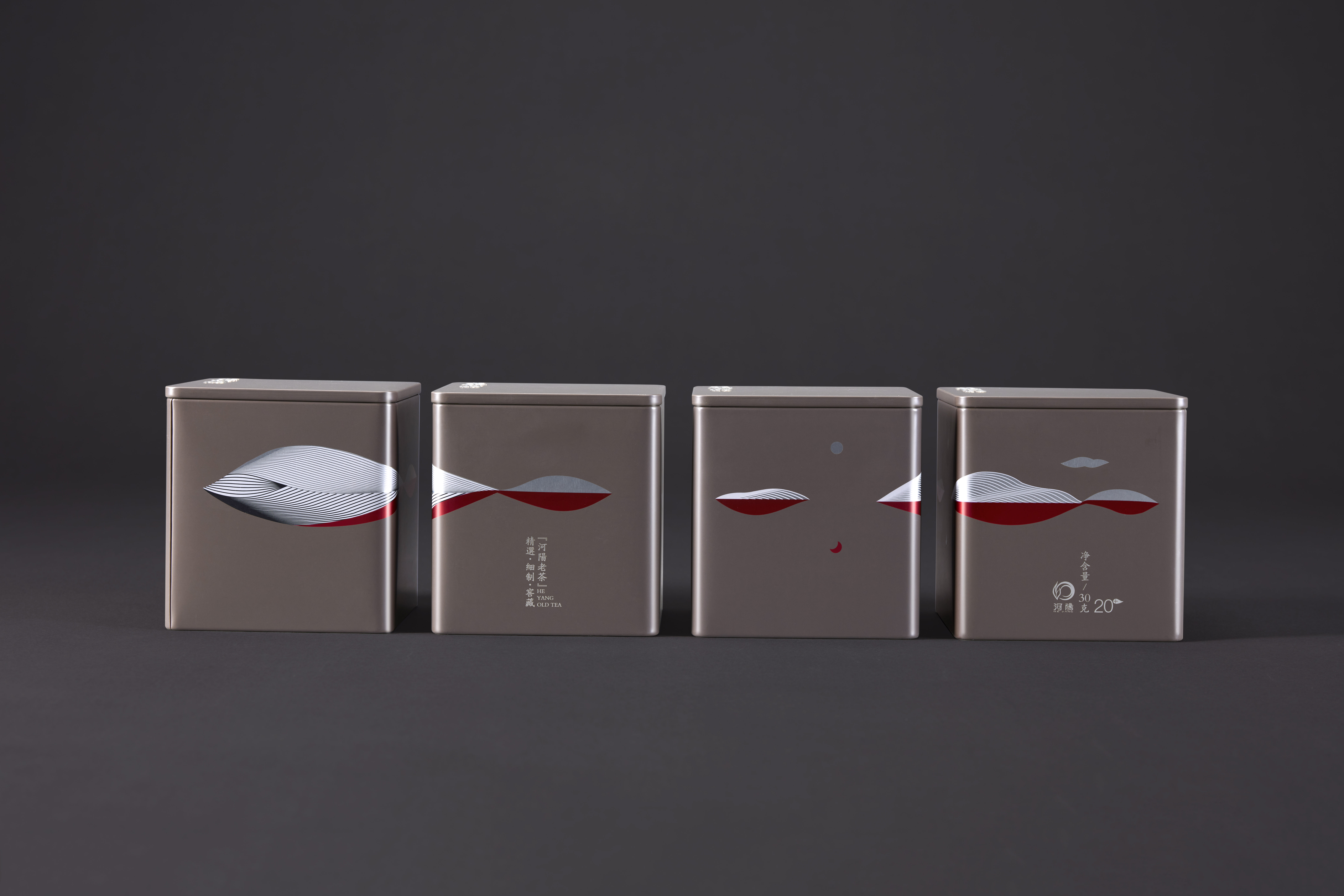
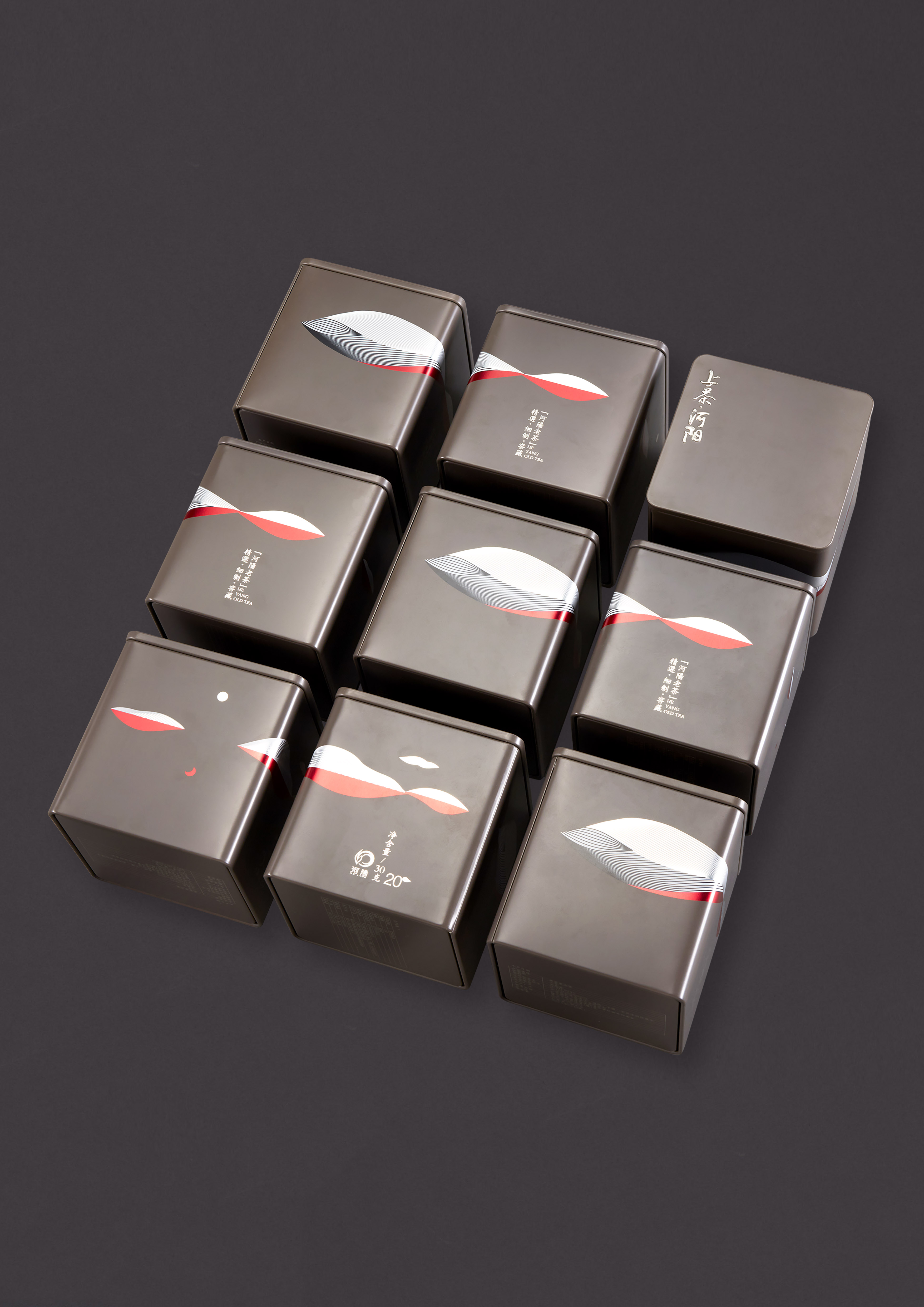
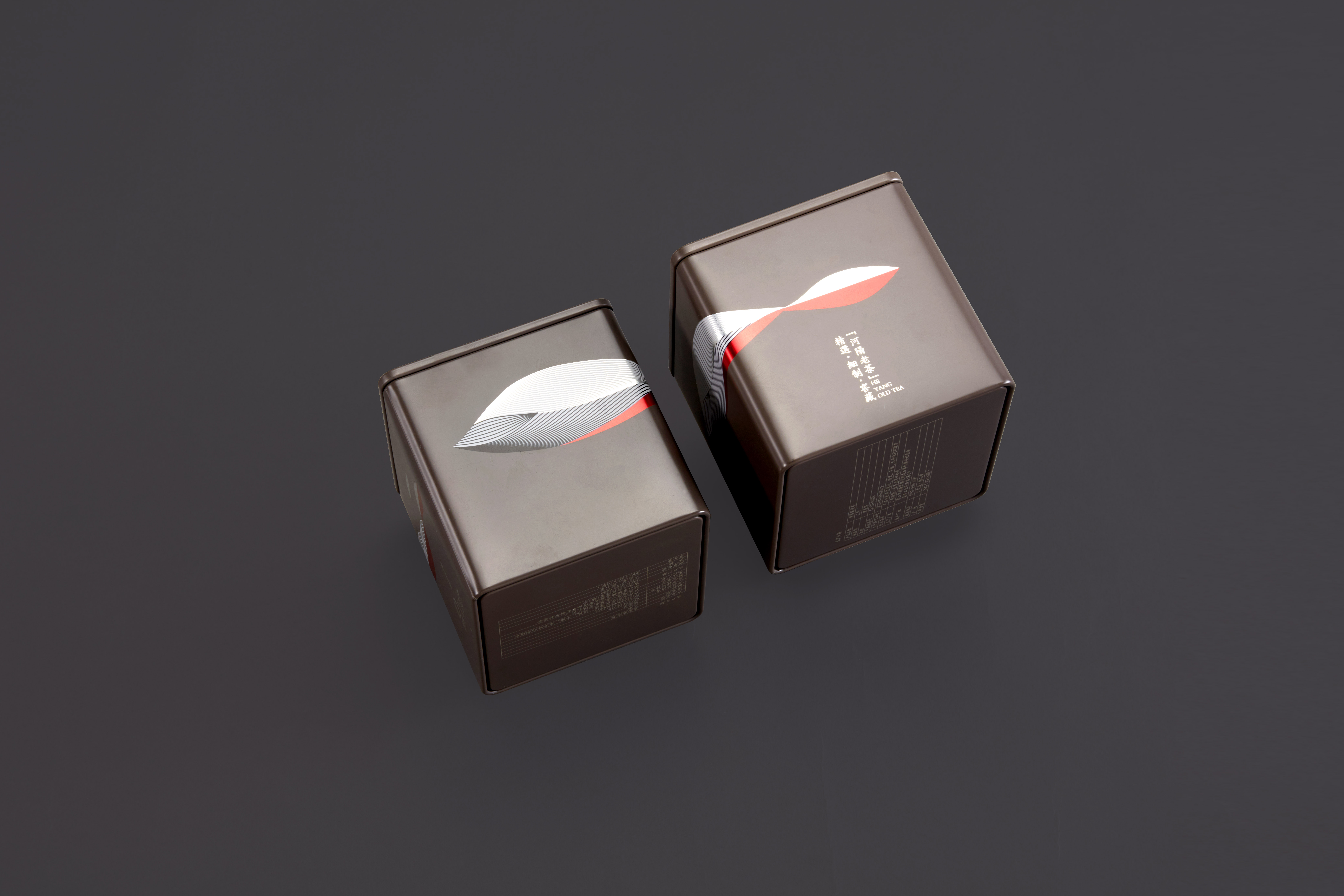
Visual and packaging design for "Shangcha Brand"
Entrant
Guangzhou Simple Culture Communication Co., Ltd.
Category
Branding - Rebrand
Client's Name
Country / Region:
China
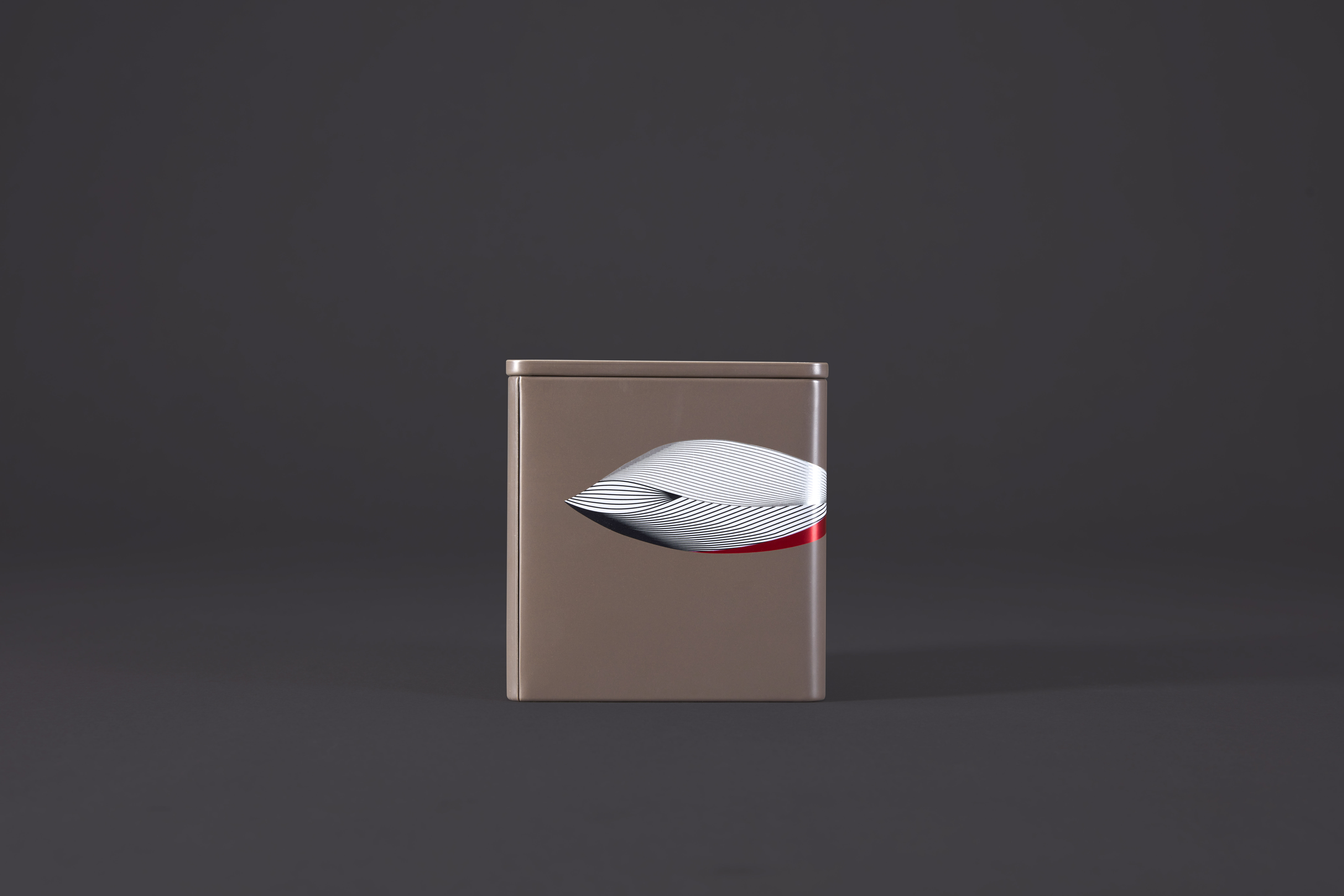
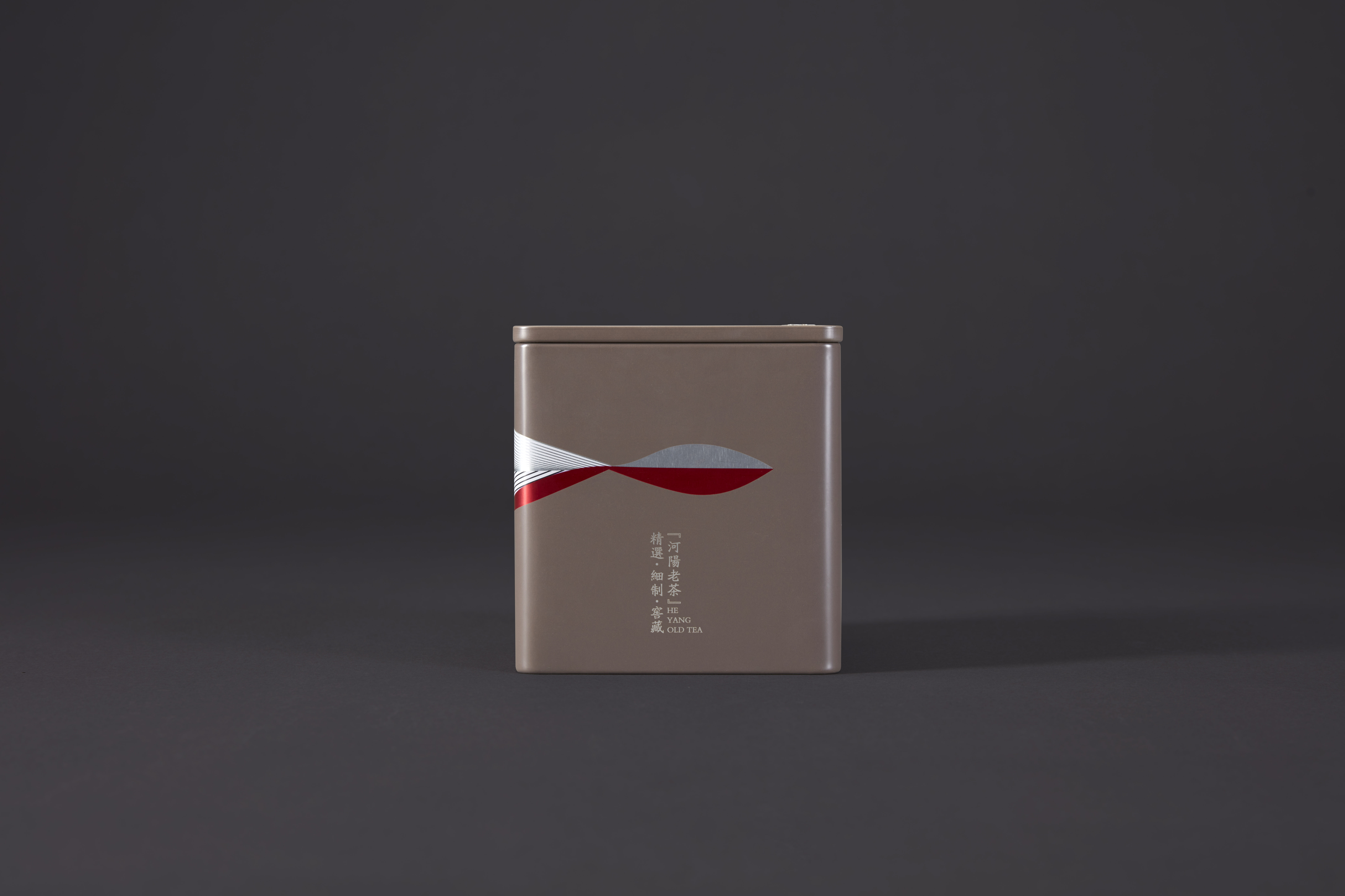
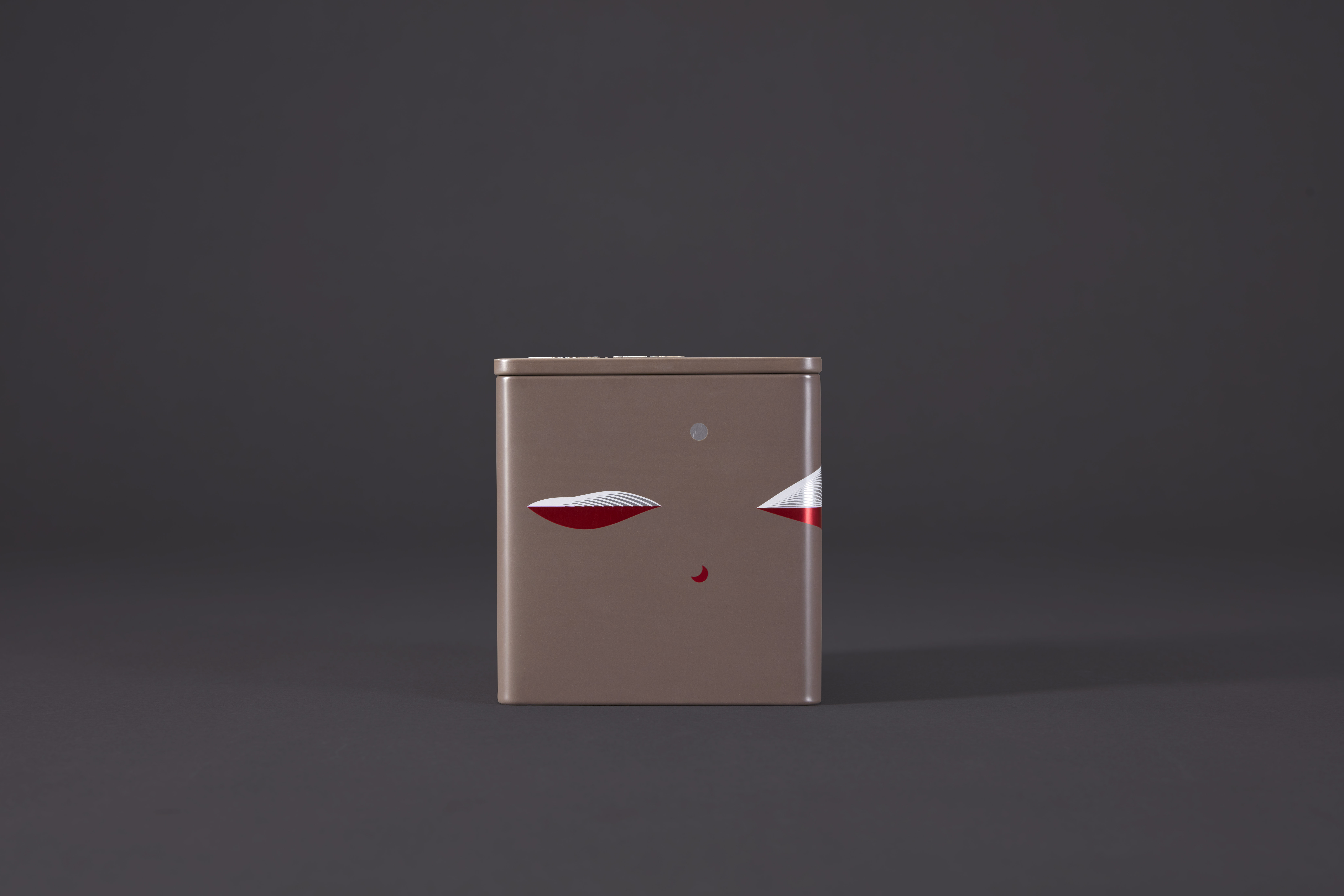
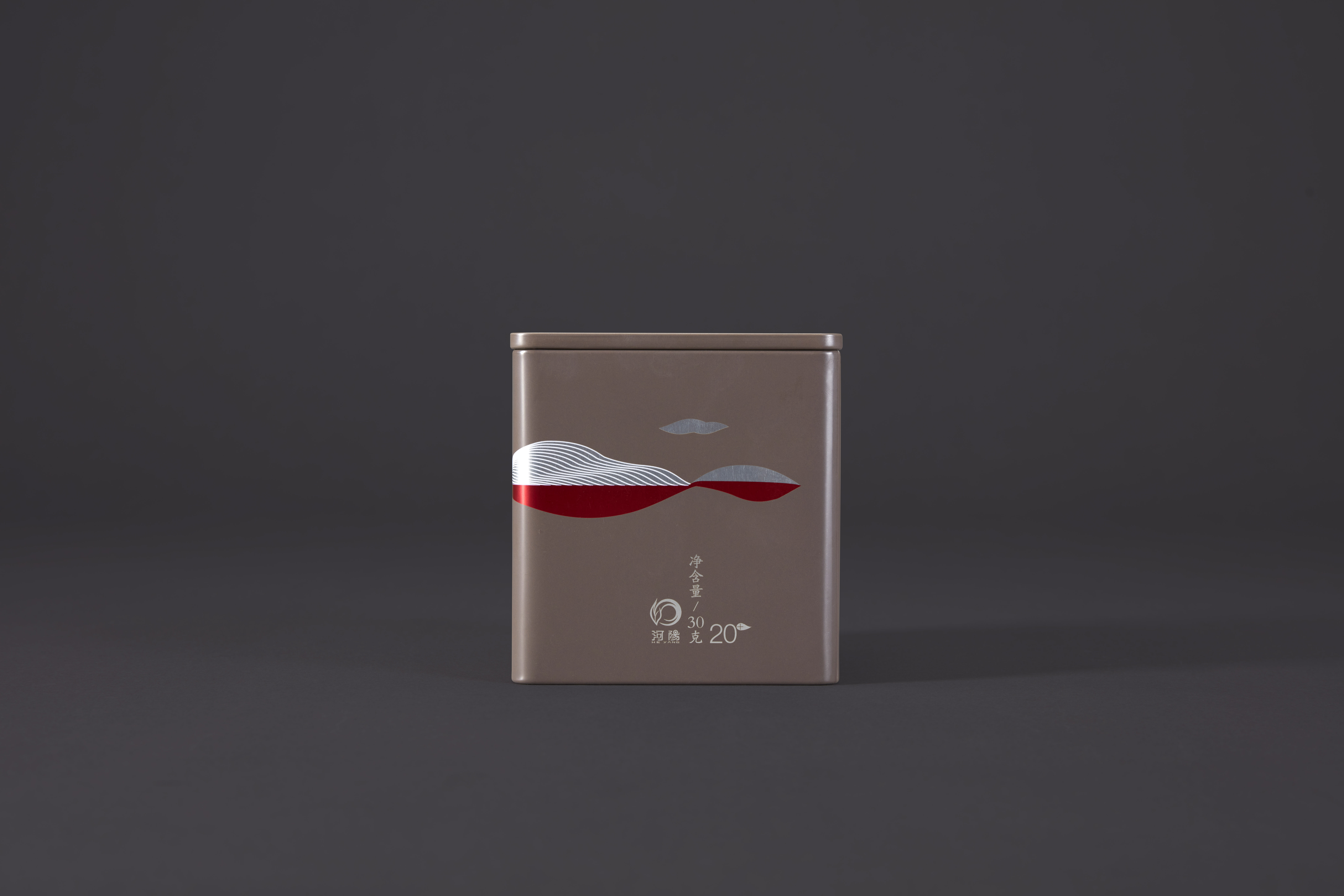
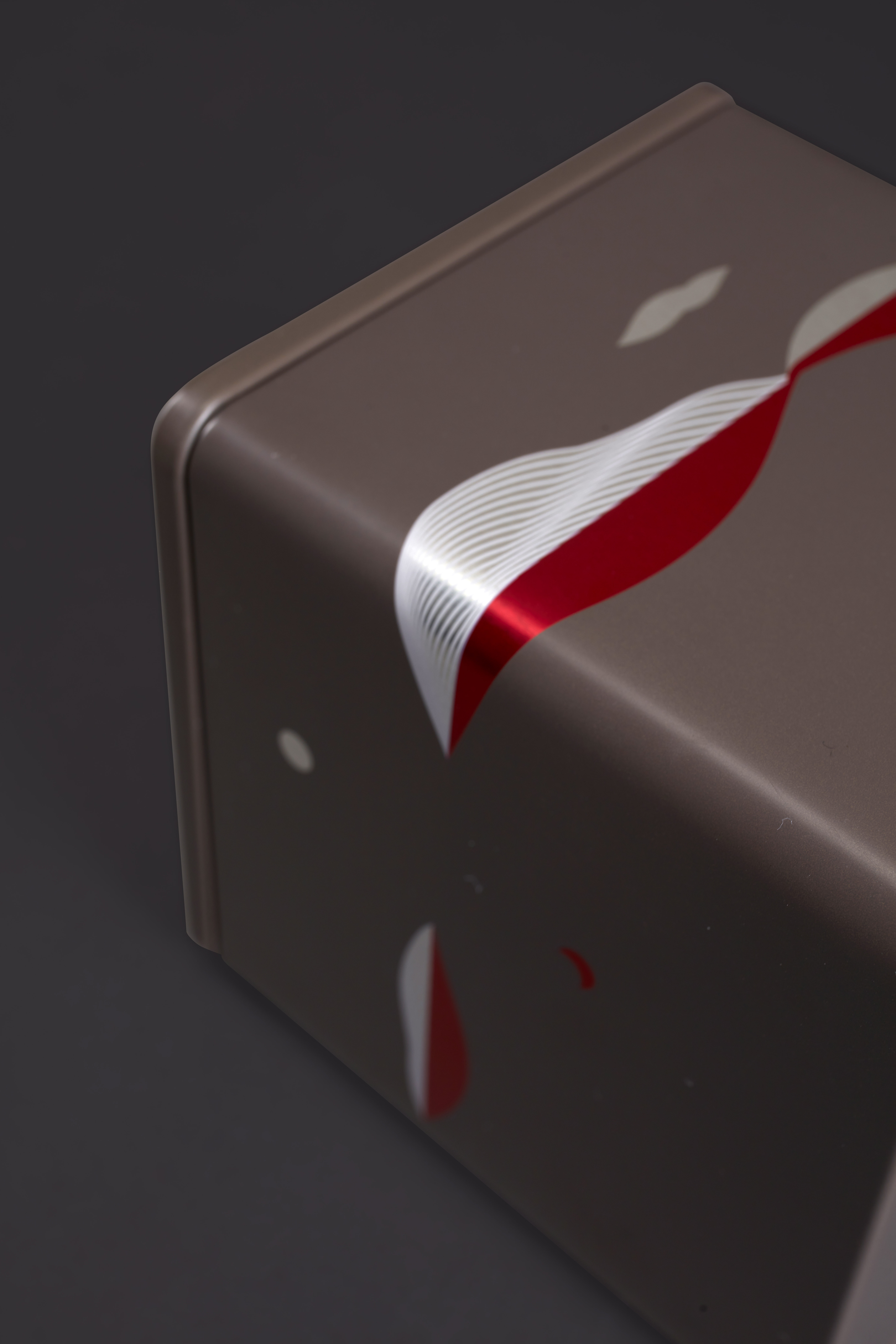
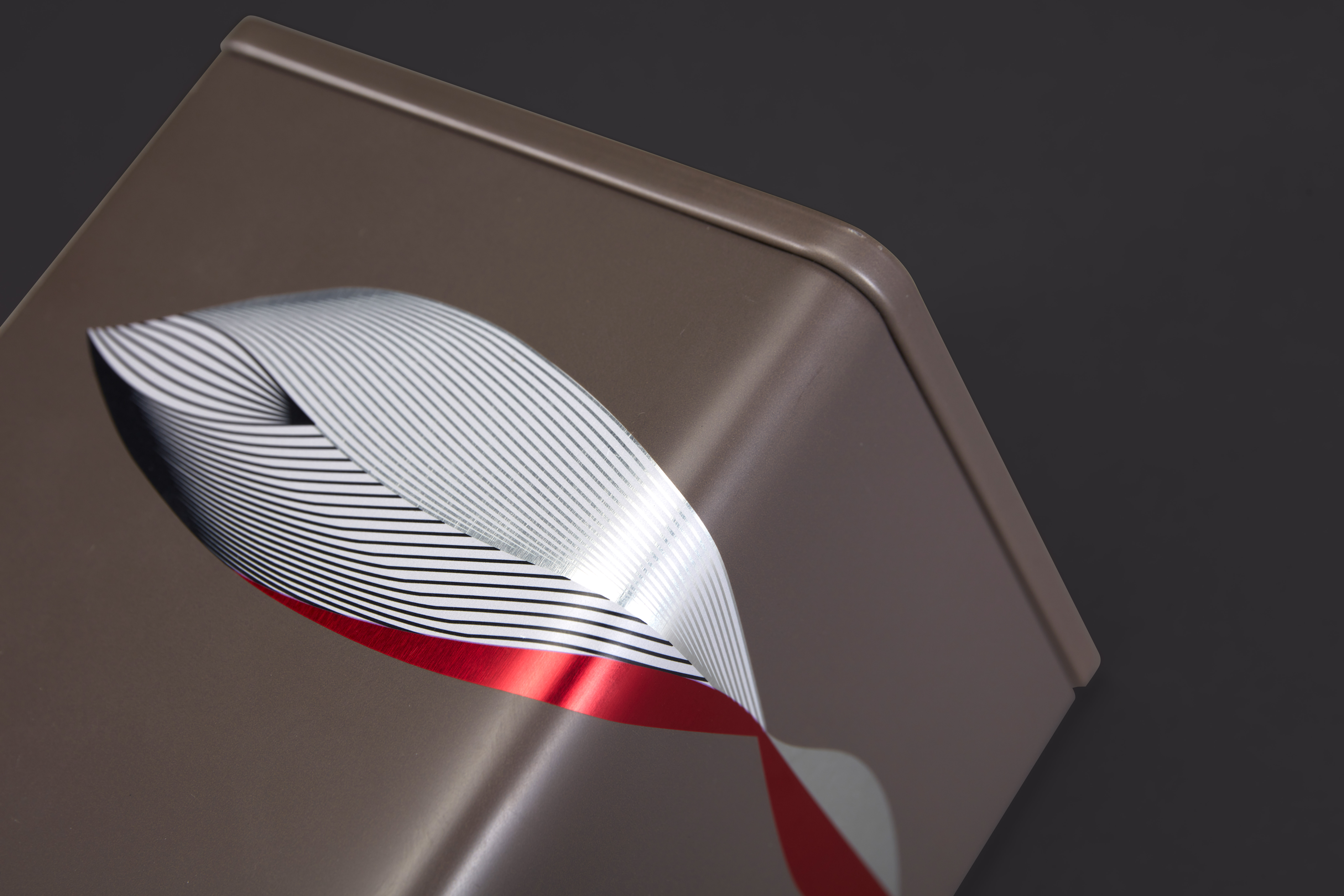
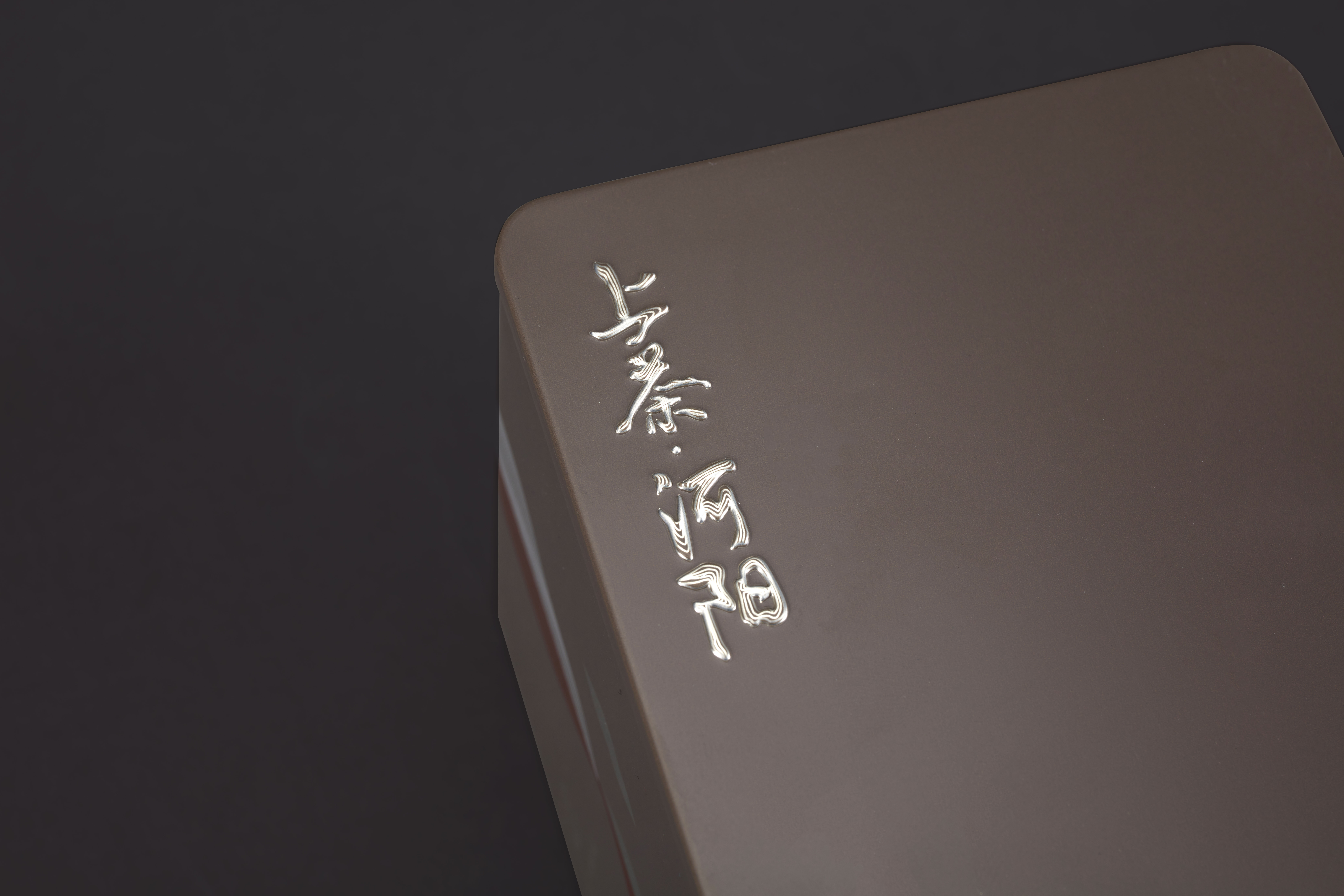
The creative inspiration for the visual and packaging design of "Shang Cha" brand comes from traditional Chinese ink landscape paintings, where the water and the sky are in one color, with Chinese elements such as "tea leaves", "landscape", "rising sun", "auspicious clouds", etc. are used to convey the unique meaning of Chinese tea culture by using the leaves as a sketch of the landscape.
The charm of white space in Chinese painting is the visual design quality of having something when there is nothing, and having more when there is less. The flow of chi chi and changes to express the "Shang Cha" tea empowerment of "Selected - Fine - Cellar", reflecting the symbolism of "Shang Cha", which implies that "The name "Shang Cha" is clear in one word, easy to remember and has cultural connotations. The color of the package is subject to the constraints of the commodity properties, so we use the color carefully, and strive to be less and more precise, simple and quick, and give people a fresh and light vision of simplicity and nature. Simple and natural vision, the overall color and style to achieve unity, the use of dynamic lines and floating tea form, the word "Shang Cha" design, different from the ordinary market tea brands.
Credits

Entrant
Qin Zhang / Shanghai Shuceng Electronics Co., Ltd.
Category
Computers-Related - Motherboards
Country / Region
China

Entrant
Baoqi Ding, Chuoer Liang
Category
User Experience (UX) - Product UX
Country / Region
United States

Entrant
Qianzhuo Zeng
Category
Home Interior - Social Design (New)
Country / Region
United States
Entrant
Suqian Maiya E-commerce Co., Ltd.
Category
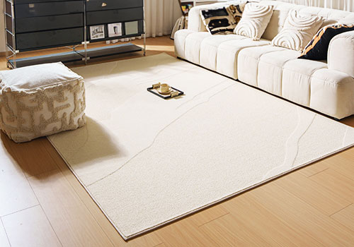
Decorative Items - Rugs
Country / Region
China