2025

Blue Peacock Camellia Oil
Entrant
Guangzhou Shenglan Food Co., Ltd.
Category
Food - Spices, Oils, Sauces & Spreads
Client's Name
Country / Region:
China
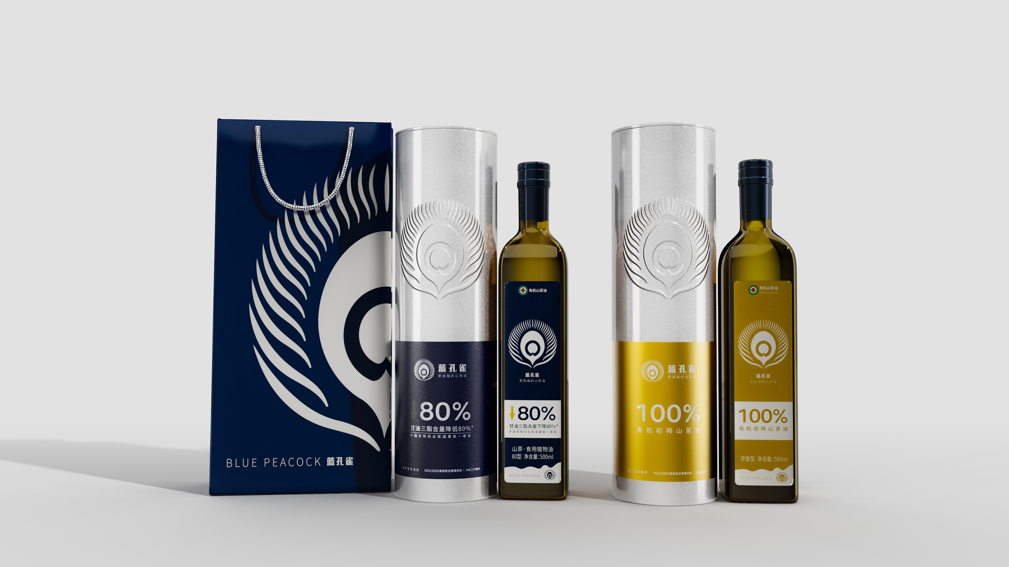
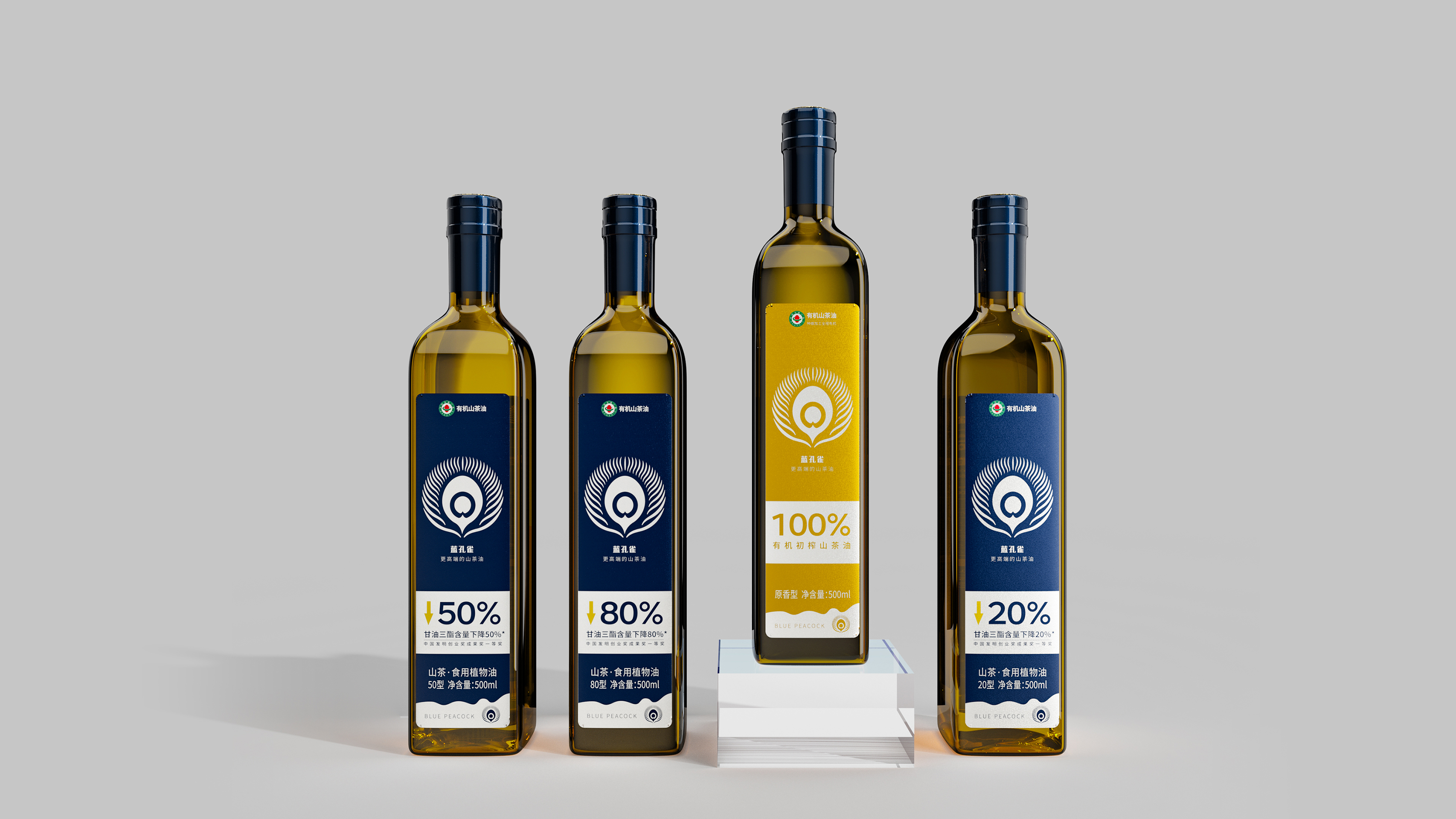
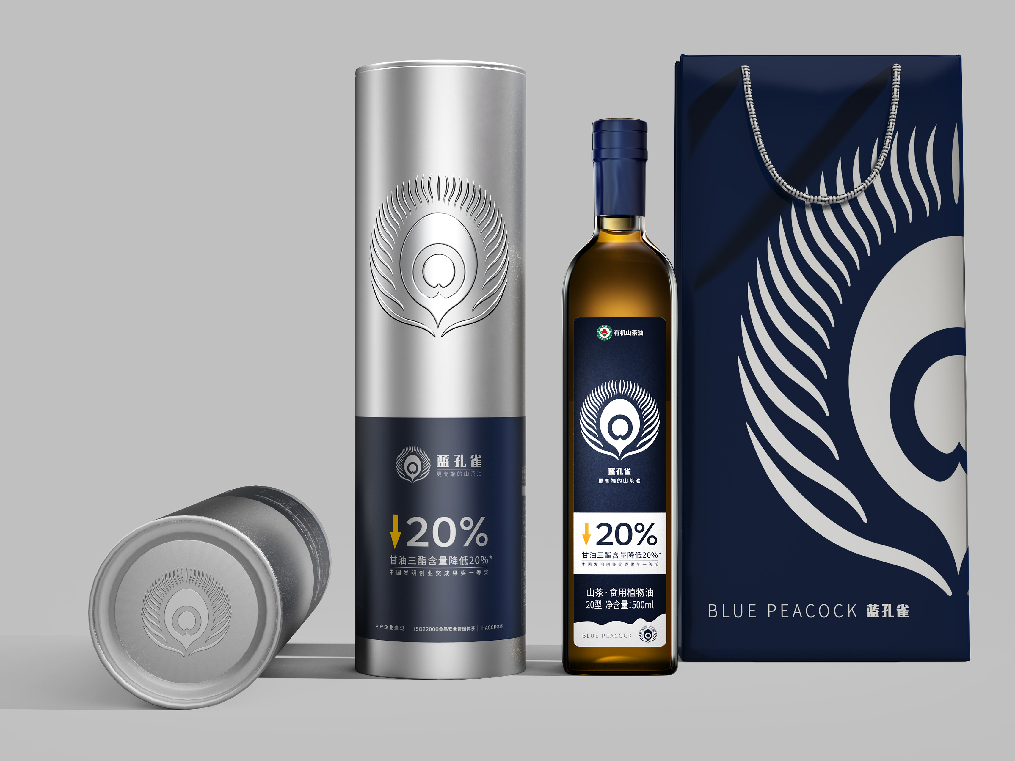
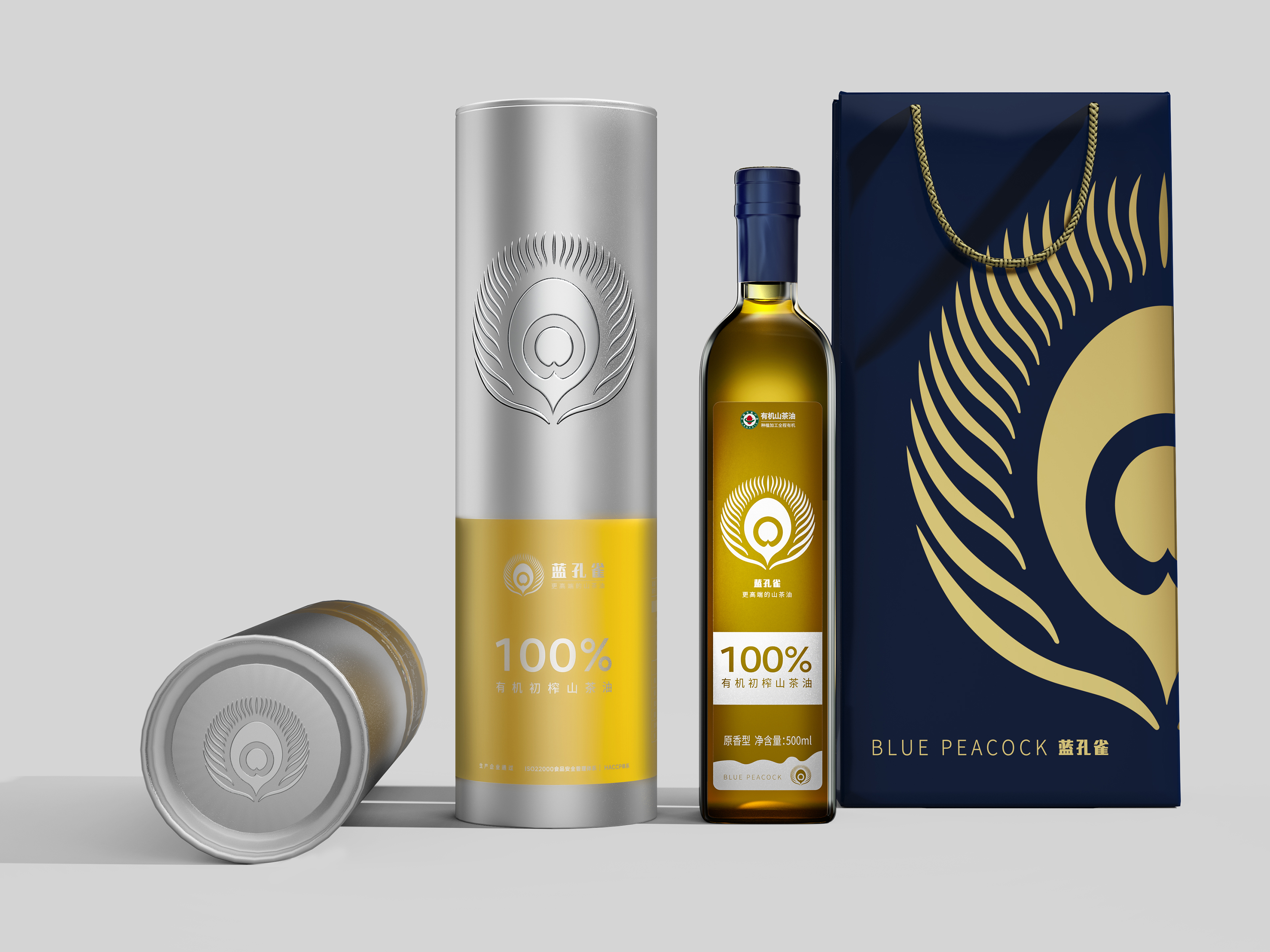
The packaging design for Blue Peacock Camellia Oil features easily recognizable numbers and arrow symbols that highlight the product's active ingredients and effects, enhancing the visual appeal while making information more accessible.
The prominently displayed numbers—20%, 50%, and 80%—are combined with downward arrows, visually demonstrating the product's impressive efficacy in reducing triglyceride levels and promoting overall health. The primary color of these numbers is blue, which conveys trust in technology and health and symbolizes the precision and efficiency of the product. In contrast, the packaging design printed with 100% uses yellow as the main color, emphasizing the purity of the product as 100% organic virgin camellia oil. Yellow represents nature and purity, underscoring the oil's natural quality. Different colors are cleverly used to differentiate the product's functional attributes, with an intuitive visual language that reflects both the purity and efficacy of camellia oil: blue signifies health efficacy, while yellow highlights natural purity, allowing users to quickly understand the product's core value.
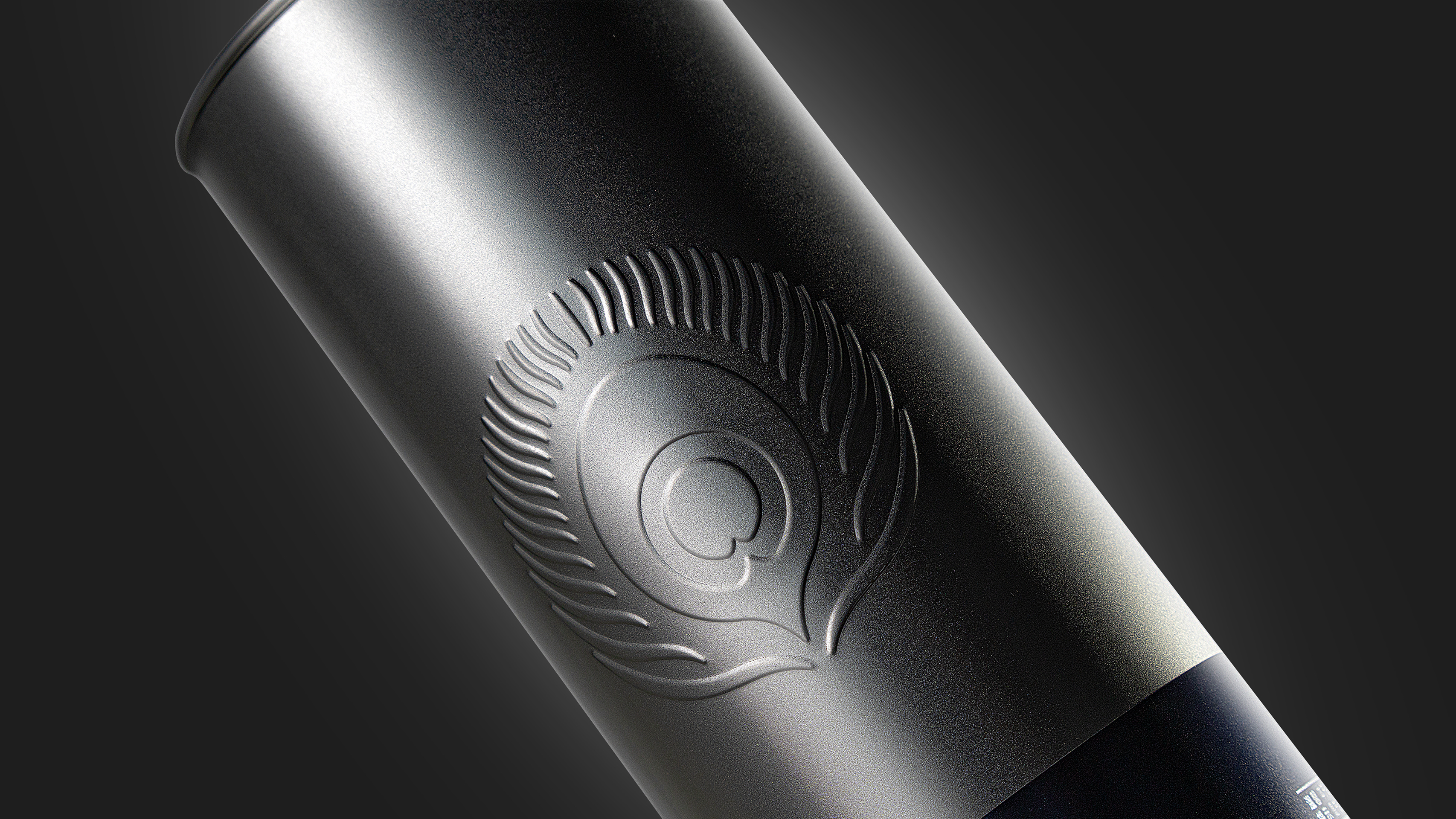
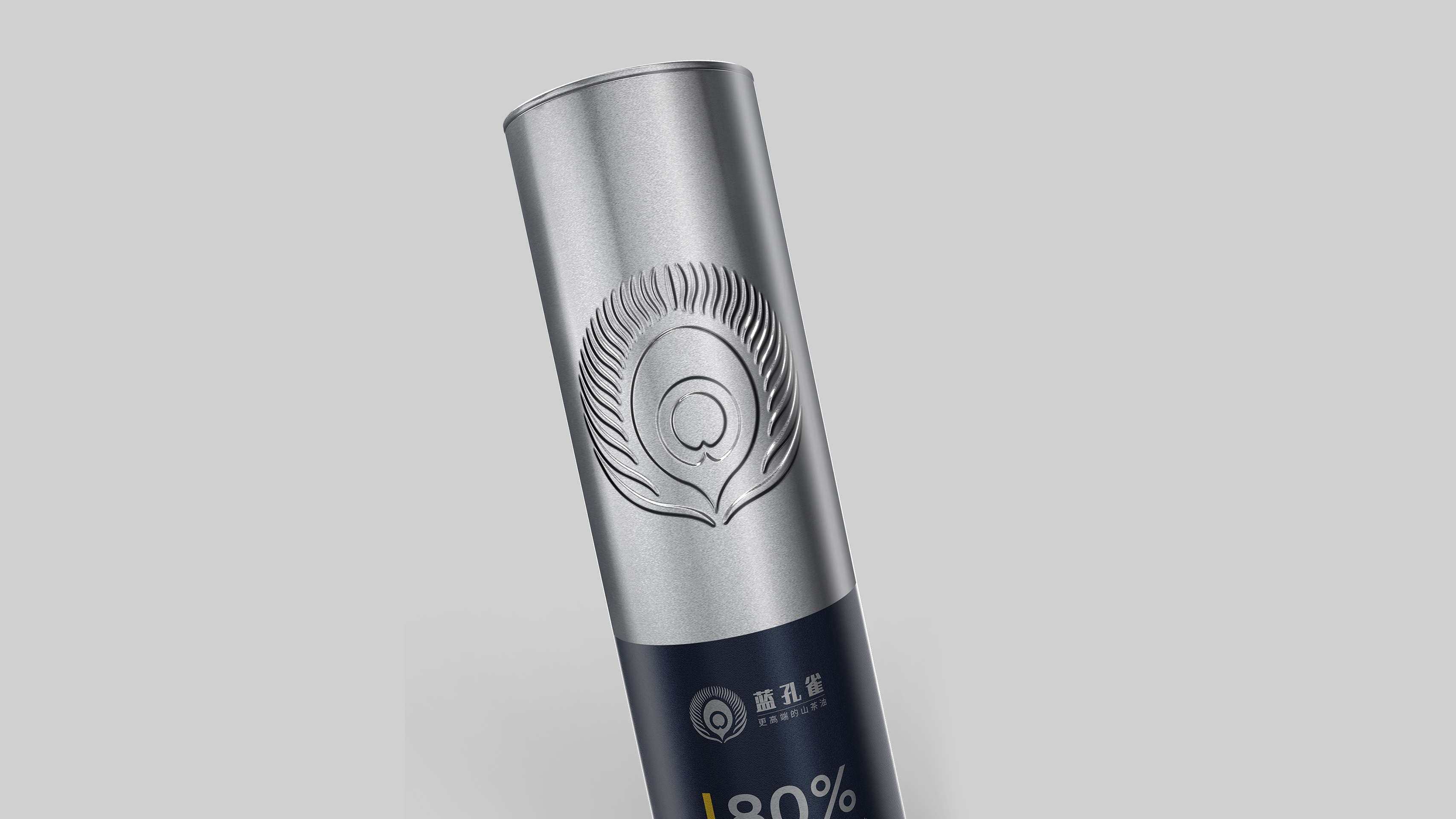
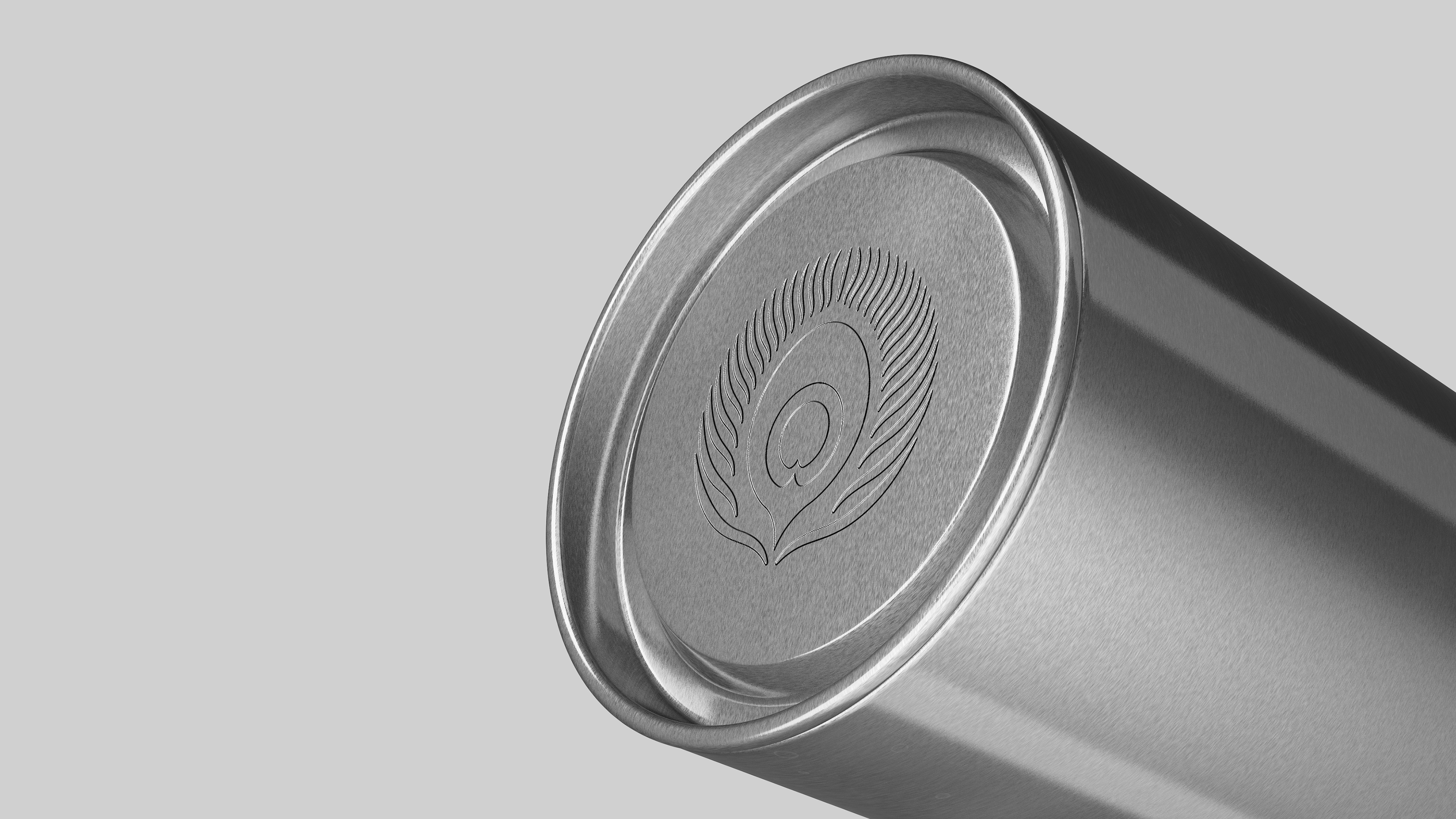
Additionally, tinplate is selected as the packaging material to convey a sense of quality and environmental value. Its durability helps ensure the oil's freshness and taste. Furthermore, the embossed logo enhances brand recognition and contributes to the overall visual appeal of the packaging.
Credits
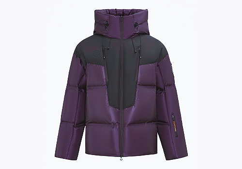
Entrant
Xuezhongfei Industrial Co., Ltd.
Category
Clothing & Accessories - Sportswear
Country / Region
China


Entrant
Zhixian Xu
Category
Social Design - Designs for Social Impact
Country / Region
United States

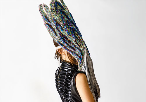
Entrant
Jingjing Guo
Category
Clothing & Accessories - Womenswear
Country / Region
United States


Entrant
Jiangxi Beitaisi Maternity and Child Products Co., Ltd.
Category
Apparel & Accessories - Sleepwear
Country / Region
China
