Packaging
MoMA PS1: A New Perspective
Entrant: SERHANT.
2026
Silver
A closer look
Project gallery.
Select a thumbnail to browse. Click the main image to enlarge.
CategoryPackaging
Class / SubcategoryBranding
Rebrand
Rebrand
Country / Region United States
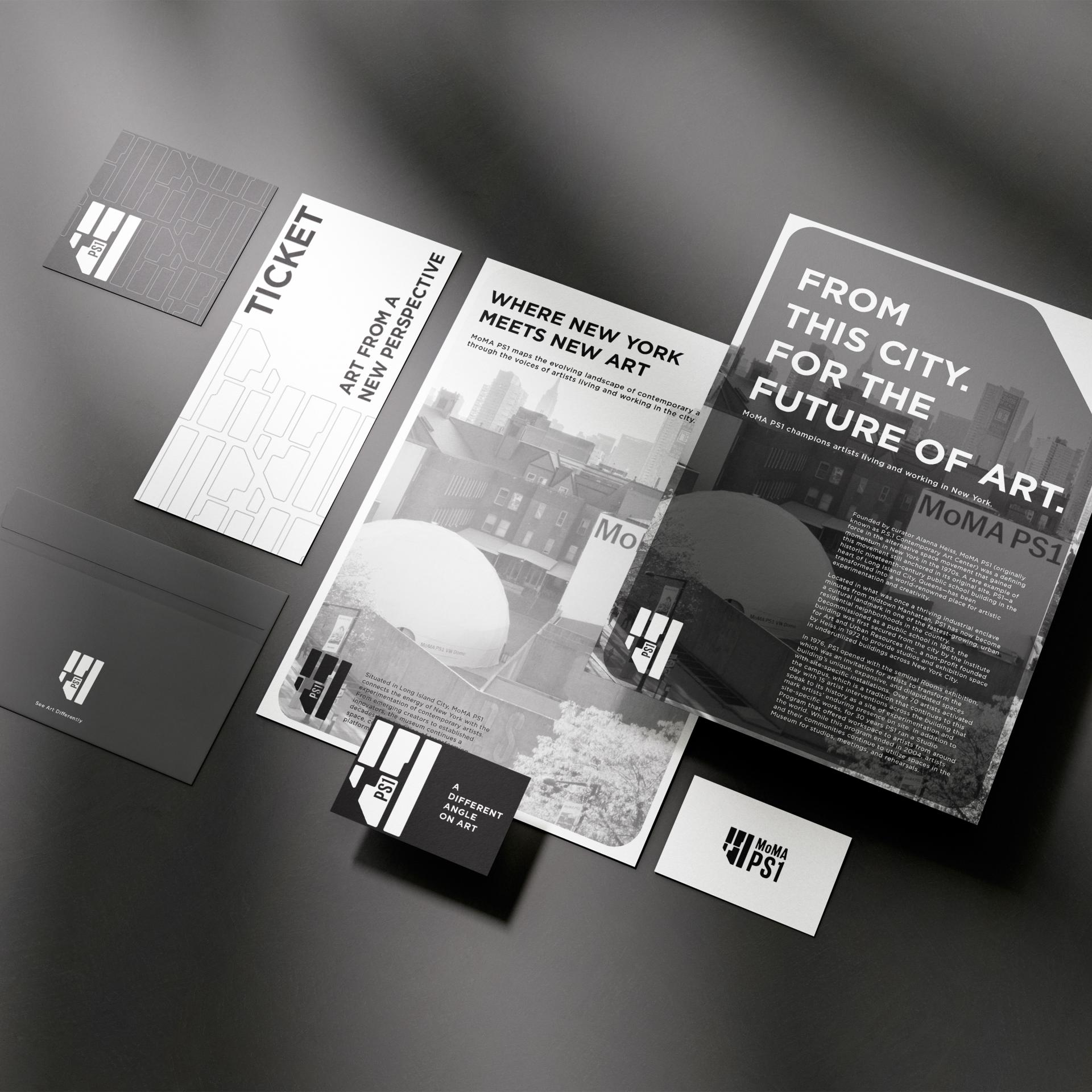
This rebranding concept for MoMA PS1 draws inspiration from the urban grid of Long Island City, Queens. By abstracting the surrounding street map from a bird’s-eye perspective, the identity transforms the city’s layout into a geometric visual system. The grid symbolizes intersecting viewpoints, ideas, and artistic practices, reflecting MoMA PS1’s role as a platform for experimentation and emerging voices within New York’s contemporary art scene.
A minimal palette of black, grey, and white allows the artworks to remain the focal point while creating a flexible identity across exhibitions, publications, and digital media. Using MoMA’s existing typeface maintains continuity with the institution while introducing a fresh visual language that highlights PS1’s distinct, exploratory character.
A minimal palette of black, grey, and white allows the artworks to remain the focal point while creating a flexible identity across exhibitions, publications, and digital media. Using MoMA’s existing typeface maintains continuity with the institution while introducing a fresh visual language that highlights PS1’s distinct, exploratory character.
Explore the project.
Keep exploring
More winning perspectives.
2026 Silver Winner
Lumen Desk
Sewickley Academy Senior High School2026 Silver Winner
Airbag Gecko-Grip Case for iPhone Series
Guangzhou Youcheng Information Technology Co.,LTD & Guangzhou Ornarto Technology Co., LTD2026 Silver Winner
LIGE Wuxing Saxophone
LIGE Zhongyi Musical Instruments & Audio (Beijing) Co., Ltd.Your work belongs in the conversation.
Begin Your Entry