2026 Silver Winner
Packaging
THE SCARECROW
Entrant: SUSURROUS DESIGN UK LTD
2026
Silver
A closer look
Project gallery.
Select a thumbnail to browse. Click the main image to enlarge.
CategoryPackaging
Class / SubcategoryBeverage
Wine & Champagne: Fine / Luxury
Wine & Champagne: Fine / Luxury
Country / Region Greece
Client’s nameNIKOLOPOULOS WINERY
Project Description – “Το Σκιάχτρο” Wine Label Series
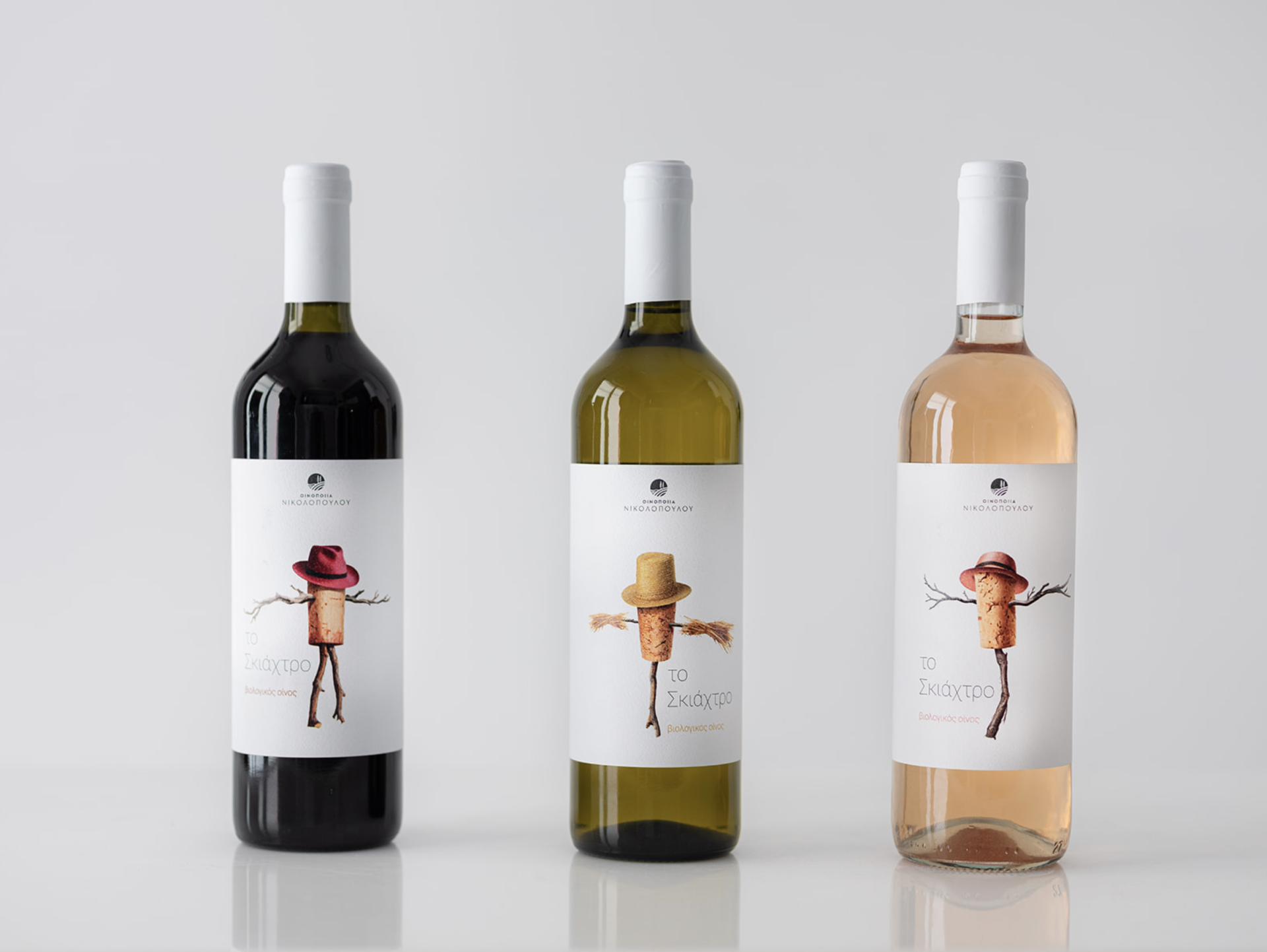
This project presents a cohesive wine label series for three wine expressions—red, white, and rosé—under the shared name “Το Σκιάχτρο” (The Scarecrow). The concept is built around storytelling, character, and subtle humor, transforming a familiar rural symbol into a distinctive brand icon.
At the center of each label is an illustrated anthropomorphic cork figure, styled as a scarecrow and accessorized with a hat that changes color and tone to reflect the personality of each wine. The cork symbolizes tradition, craftsmanship, and authenticity, while the scarecrow evokes protection, nature, and the vineyard’s close relationship with the land. By combining these elements, the label bridges heritage with a modern, playful visual language.
The minimal white background allows the illustration to stand out, giving the bottles a clean, contemporary presence on the shelf while maintaining a handcrafted, artisanal feel. Typography is intentionally restrained, ensuring legibility and balance, and allowing the illustration to act as the primary storytelling element.
Each label maintains a consistent visual identity while subtle variations in color and mood differentiate the wine styles:
The red wine conveys depth and warmth.
The white wine expresses freshness and balance.
The rosé reflects lightness, elegance, and approachability.
Overall, the project aims to create a memorable, character-driven wine brand that feels approachable yet distinctive, appealing to modern consumers while respecting traditional winemaking values.
This project presents a cohesive wine label series for three wine expressions—red, white, and rosé—under the shared name “Το Σκιάχτρο” (The Scarecrow). The concept is built around storytelling, character, and subtle humor, transforming a familiar rural symbol into a distinctive brand icon.
At the center of each label is an illustrated anthropomorphic cork figure, styled as a scarecrow and accessorized with a hat that changes color and tone to reflect the personality of each wine. The cork symbolizes tradition, craftsmanship, and authenticity, while the scarecrow evokes protection, nature, and the vineyard’s close relationship with the land. By combining these elements, the label bridges heritage with a modern, playful visual language.
The minimal white background allows the illustration to stand out, giving the bottles a clean, contemporary presence on the shelf while maintaining a handcrafted, artisanal feel. Typography is intentionally restrained, ensuring legibility and balance, and allowing the illustration to act as the primary storytelling element.
Each label maintains a consistent visual identity while subtle variations in color and mood differentiate the wine styles:
The red wine conveys depth and warmth.
The white wine expresses freshness and balance.
The rosé reflects lightness, elegance, and approachability.
Overall, the project aims to create a memorable, character-driven wine brand that feels approachable yet distinctive, appealing to modern consumers while respecting traditional winemaking values.
Explore the project.
Project credits.
KARASOULAS GEORGE
CREATIVE DIRECTOR / ILLUSTRATOR
Keep exploring
More winning perspectives.
2026 Silver Winner
UWANT 5-Blade Electric Shaver
Suzhou Jiandanyouwei Technology Co., Ltd.2026 Silver Winner
HANKE BLACK LABEL
Guangzhou Luoqi Bags & Luggage Co., Ltd.Your work belongs in the conversation.
Begin Your Entry